
#LowHanging: Modest Proposal for iTunes List View
/I live in List View in iTunes. This is because most of my iTunes interaction is with podcasts, which I listen to while commuting, riding my bike, cooking, etc., for many hours a week. My user story involves refreshing my podcast collection each day, noting (in the Downloads window) what is new), selecting and transferring podcasts to a playlist on my iPhone, and arranging the playlist.
With about 1200 podcasts downloaded, and about 25 lines of listing available per "screen" on my laptop, that's 48 full screens of podcasts to look through (if a "Next Screen" function were available). Scrolling is the default solution, either by trackpad, the thumb scroll, or scroll wheel on my mouse. (Note: searching is not a good option, because you cannot search for "newest" episodes and you might want to discover older episodes.) Scrolling is visually tedious, and produces two problems: "getting lost" and losing visual distinction between podcasts and episodes.
Losing one's place in the list happens because scrolling rapidly enough to make progress through the list results in visual "blur", which leaves the user uncertain what just went past and if parts of the list had been skipped. It's hard to demonstrate in still images, but give it a shot and you'll probably experience this. One major reason for this is that the blue dots on the left dominate the visual field while scrolling. They are the most saturated and boldest (to misuse the word) element in the list, and anchor the user's eye to an almost solid border of blue hard on the left when the user scrolls. Even if the dots don't appear or are half-filled (indicators of episodes half-listened to or not downloaded), it takes many to overcome the solid blue line. And the checkboxes reinforce the problem. The text is simply overwhelmed in motion as the eye tracks vertically, rather than horizontally with the text. The result is often frustration.
(Note: There's no good automated way for me to set up a podcast playlist that I change regularly. iTunes does have a feature for syncing latest episodes of podcasts, but that's not a real solution. Many of the podcasts I listen to have years of archives, some have episodes I'd rather skip, and some are defunct but still worthwhile.
Some of the podcasts are
time-sensitive (Talk of the Nation, Political Junkie, To the Point, Real
Time, and other news) but most are not (This American Life, Wait What?,
99% Invisible, the SpoolCast, On the Media, Commonwealth Club, and many
others). What this means is that before I go out on the bike or to
commute, I go through my podcast library, which I update every day, and
pick and choose what I want to listen to. As implied, this could be a
mix of recent news (The Political Scene), a fun piece of entertainment
(By the Way), or archived knowledge (Boxes and
Arrows, the Nitch, City Arts and Lecture) that I'd like to learn.)
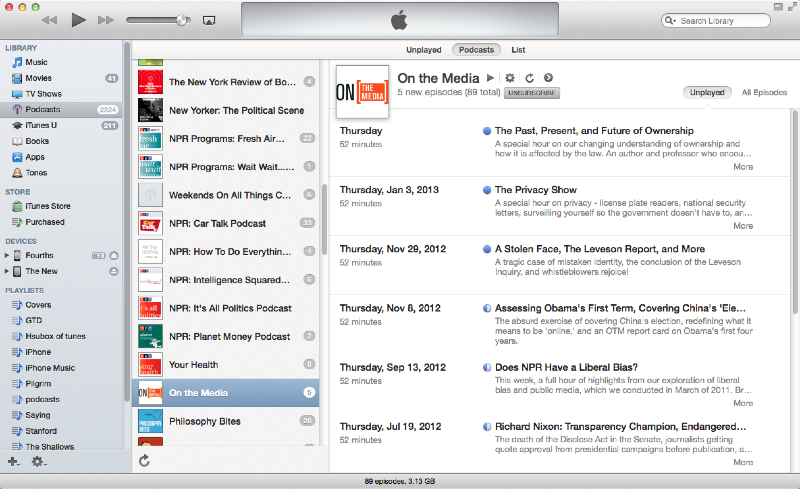
The iTunes podcast view
So I use List View. Which has its own usability issues.

iTunes List view
I suggest three possible tweaks that could mitigate these problems and reduce user frustration: indentation, shading, and bolding.

Indented iTunes List View
Indentation is a common mental model for hierarchical organization, a model reinforced by word processing, outlining, and presentation software. Apple, in fact, makes that kind of software. This presents breaks in the wall of blue dots and could make locating oneself much easier even when scrolling rapidly, and note where one podcast list ends and another begins.

Indented with shading
This indentation could be reinforced with shading; this is a useful visual differentiator in wireframes. Though the opacity here might be a bit dark.

Colorized podcasts
Alternately, the podcast titles could be highlighted, though their relative low numbers could invite visual confusion with them being selected (while the episode areas being shaded looks more like an area).

Bold those podcasts
The titles could also be in bold or a larger type; this would also work with standard hierarchical representations from other types of software.
Testing would be key, of course. A/B testing could be set up between any two of these options, and combinations (bold podcast+indent v. bold podcast, etc.). This would give hard data whether any one or combination results in some improvement in usability — reduced "scrolling past", quick location of podcasts). I can't guess how many users for testing this would require, but even a handful would give important feedback.
And also of course, too, Apple is not known for doing usability testing outside of its own labs. Therefore, to sell this idea to Apple, the best path would likely be to show data that there is a significant issue for user with the current design, and couch the data for our best solution in aesthetic context (I do think the indented version looks better in addition to likely working better).
Thoughts?