I'm Not Super Happy with the Lion Upgrade

In the two years I've had this Macbook Pro (basic model), I've had to restart maybe a half-dozen times total, with only two force restarts. That is, until I upgraded to Lion. Problems with the new Mail UI aside (the old Mail with WideMail could show half again as many items in the Inbox at once), I've seen serious RAM usage and have had to force restart twice in the last week. Any suggestions? I've booted from the install DVD I made according to Apple's own instructions and run Disk Utility and tried to make sure I have current versions of all apps.

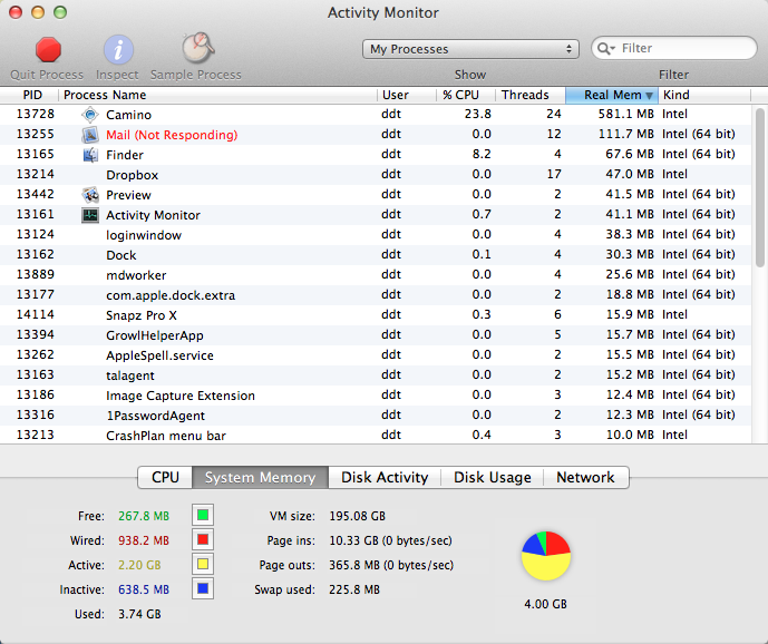
activity.png


Note that only three apps are running, and over half my installed RAM is Active. One more app and the OS starts going to my hard drive for memory.

gray_screen.jpg


I tried logging out to clear the RAM use. This is what it looked like for 10 minutes. I had to force restart.

#UXfail TweetDeck (and Twitter)

tweetdeck_fail.png


tweetdeck_fail2.png


The first image is the full pop-up window you get when you click on the TweetDeck upgrade link from within the TweetDeck desktop app. Note how the window is not sized well for the content. Not even nearly.

The second image is what happens if you try to resize the window. Granted, part of the problem may be OS X Lion's lack of window chrome (boo, in of itself), or that this is an Adobe AIR app. But did nobody test this? Especially ironic is that this makes it really difficult for the user to GET YOUR PRODUCT.

Yet Another Offensive Aspect of "Homeless Hotspots"

Let's put aside the obvious patronizing and exploitative features of the BBH-marketing-firm-driven "homeless hotspot" stunt. That's an exercise left to the reader. What I want to focus on are the assumptions, stated by BBH's Saneel Radia on Marketplace, that (1) this is simply using the Street Sheet "model" and (2) that the point of writing, editing, printing, and distributing a newspaper by the homeless and about homeless issues is all about... getting a wee bit of social interaction.

What we're doing is we're taking a model that exists already -- street newspapers. It's really that social interaction point, the ability for them to express themselves, to be a bit entrepreneurial. Again, if you really get into the experience, it is the opposite of condescending. It's very empowering, actually.

I call multiple, steamy layers of BS. Have you ever read Street Sheet? It's usually well made, insightful, and brings to attention issues affecting millions of people that you don't see on CNN. Just recently, the San Francisco-based Street Sheet collected position statements from candidates for District Attorney, had been active in the issue of making MUNI (local public transit) free for youth, and been on the scene at various Occupy protests. Hey, marketers: there's value in content, and content is not fungible.

Also, the process of reporting, writing, editing, producing, and distributing an actual product (as opposed to, say, doing whatever marketing firms do) keeps a person's mind sharp, which is hard to do when you can't afford an iPad or are engaged in daily work beyond survival, and provides skills and job training. There are many stories of homeless people pulling themselves up, as the saying goes, through the work street newspapers provide.

So, those are the "models" street newspapers provide. You think all a homeless person wants is to be graced by your patronizing presence for a few moments, in exchange for a few pennies?

Go market yourself, Saneel.

Mitt and Dale: Why Mitt Romney is a Bad Implementation of a Candidate (and What That Says About Him)

If you want to know the true measure of someone, it's all about how they react when things aren't going their way. By now, the one thing we really know about Romney as a person (aside from the fact he's fabulously wealthy, to the extent that he and his family are almost on another, gated, branch of the evolutionary tree) is his ability to say jaw-droppingly awkward things when forced to talk to, you know, people. The examples are legion: "I like grits", "the trees are the right height", "who let the dogs out?", "garbage bags", and many, many more. What's in common in these gaffes? Why can we almost see the "I need to note something about an individual or locality, express that I see it, and say that I, too, am that" app load screens come up on Romney's main display?

Of course I'm guessing here, but I think it can be traced back to Dale Carnegie's "Six Ways to Make People Like You". My sense is that this framework is still floating around management training courses that were the Petri dishes Romney swam out of at some point, and since a small use worked once for him, he's upping the dose in order to Make It Work on a large scale. The problem he doesn't see is that it doesn't scale, and it doesn't work when you can't pull it off.

Six ways to make people like you 1. Become genuinely interested in other people. 2. Smile. 3. Remember that a person's name is to that person the sweetest and most important sound in any language. 4. Be a good listener. Encourage others to talk about themselves. 5. Talk in terms of the other person's interests. 6. Make the other person feel important - and do it sincerely.

We can give him a partial pass on #4, as most of the interactions where the Romney suite of apps fail are not interactive, but variants on PowerPoint -- that is, he's presenting, not collecting data. Though his "I give the answers I want" moment near the end of the 11,432nd CNN debate is a fail. And really, not something you want the leader of a nation to be in the habit of saying (accountability is A Good Thing).

As for #1, well, empathy to strangers wasn't in the original design specs for Romney. And, again to be fair, it's a hard thing to ask given the nature of a campaign -- though Bill Clinton was amazing at it (I once heard him at a mall greet of thousands of people, and when someone said he was so-and-so's old roommate, Clinton knew who he was talking about, and asked him personal questions about their mutual friend).

#2 is an interesting case. Of course it's good to smile when you meet people. But again, Romney has taken the "it's good, so more is better" idea to the point it stops working. Or maybe he's afraid that dropping the smile will dock his relatability and likability rating even below that of, say, an STI. Take a look at how Romney holds on to that rictus in tough situations -- being pressed for answers, being challenged in interviews or debates. Is he trying to signal "I'm above this attack", or "this doesn't bother me"? I suspect someone once told him that Carnegie's #2 was key -- because the business world is small, and even if you screw someone over in a deal, you want them to think there's a chance it wasn't personal, just a game, and that there's so little bad blood between you that they'd be willing to get into a position for you to screw them over again.

(You could see something similar, though at a smaller scale, in Wesley Clark's 2004 bid. Look how the military man responds to a military question and compare to his face at the start of a Chuck Todd interview.)

The meat of it is a combination of #1, #3, #5, #6, and the special sauce of trying to show that one can relate. The problems arise in that a) Romney is not genuinely interested in these other people and b) he tries to combine #5 and #6 by saying "I do that, too" -- but not only does he not, he doesn't realize that replacing "that" with his closest match is not a viable substitute.

Just type "Romney NASCAR" into your favorite search engine and you'll see only ridicule about his comment -- at a NASCAR event -- that though he's not a big fan, he has "some great friends that are NASCAR team owners". This is a great example of the big fail of blindly applying Carnegie's rules. If he were honest, he could say something like, "I've never been to one of these -- it seems cool! Tell me more about it?" People actually love sharing their interests and passions -- if you're American, go to a pub during the World Cup, buy a pint, and ask someone to explain what they love about soccer (excuse me, football). But Romney was programmed to show that he already shares your interests, and that Your Concerns Are My Concerns, Too, So We're The Same. And that this will lock in someone's vote.

What's worse about this, aside from seeing the last dregs of someone's soul evaporate before your eyes, is it signals not just a lack of true care for individuals (to be fair, who can really care about every random stranger one meets when one is faced with hundreds, if not thousands, of them on a daily basis for months and years on end?), but the worldview that people are fungible products, means to an end, and not an end in themselves. They are assets to be collected and traded in for what you really want, stars or rings that'll add up to a power-up in a video game. It's an asset manager's view of citizens, and a blind application of a limited algorithm.

And what's even worst? What this shows is a blind application of learned rules, not the ability to think critically and rigorously. It's the same as a student turning in lecture notes about a Shakespeare as an original paper. This actually happened to me, as did the student asking, "Why, isn't this right? It's what the professor said -- are you saying he's wrong?" At some point this tactic worked for Romney, so now he's applying it. The goal is bigger? More cowbell.

This does not seem like a winning strategy for the leader of a complex, contradictory, nation.

What I Did Last Weekend (AngelHack Edition)

Climatix_video.png


climatix_logo_128.png


Use cases, user interaction flows, icon and graphic design

My first-ever iPhone app icon!

And here's the video:

map_result.png


First quick pass on map display wireframe

map_enviro.png


map_energy.png


Climatix grew out of a project begun by Robb Miller and Nick Orenstein at a green technology hack. The goal was to enable users to visualize, at a personal level, the vast but arcane data available about air pollution, power plant emissions, groundwater quality, as well the carbon footprint of facilities they may see every day. All this information is currently in open databases; it's there for the taking, but nearly impossible for the average person to make sense of. Security through obscurity, in a way.

The Climatix mobile app allows users concerned about environmental (policy, development, social justice, zoning, and health) issues to explore their world in a familiar and interactive way, seeing in real(ish) time the environmental and energy usage hot spots around them, or wherever they search. Not only can users use a familiar map interface, but Climatix's augmented reality (AR) interface, built on the Layar API, shows users these hot spots within the real world, and how to get to -- or avoid -- them.

Users can also add to the environmental data in a unique way. If a user sees a potential point of concern, whether it's a suspicious dump, a wasteful business, or leaking pipe, he or she can take and upload a photo to the Climatix app. This pins real-world experience to formerly abstract data and can teach all users of the Climatix app the cost of pollution, or uncover hidden sources of it.

This is a great tool for: individuals curious about their local environment, urban planners, local/state governments that want a better sense of where they need to focus their scarce resources, real estate developers, health researchers.

Most of what affects our lives and health -- air, energy waste, toxins -- is invisible. The Climatix app allows users to see this hidden world, and help uncover it further.

[Also on the project: Rico Mok and Evan Huang.]

See Climatix for more information.

Two Things You Want to Hear from Customer Service

Whether it's tech support for your computer, or HVAC, or a government agency, or your health insurance company: 1. Click click click. "Oh, I see what's going on."

2. "There, that should take care of it."

The first means that the company gives customer-facing personnel direct access to account info and the entire flow of decisions affecting it.

The second means that customer-facing personnel can actually make decisions and reach into the spaghetti of rules, regulations, and settings to fix something.

(My small ISP is a good example of both; Blue Shield is a bad example of both.)