Framer.js First Pass at Layers

In learning Framer.js, I first wanted to get a sense of layers, hierarchy, and positioning. The UK flag posed a unique challenge as the Saint Patrick's Saltire (the red diagonals) would weave over the Saint Andrew's Cross (the white diagonals) but under the white crossbar (which I'd be grateful for explanation of).

To be clear, every element in this image is generated in Framer.js/CoffeeScript. So each element could be transformed within code dynamically, and is exposed to click actions.

LOOK I MADE A USABILITY TEST

If you ever run into a boss or a startup founder who tells you they don't have time or resources for "research", gently point out that the essence of research is testing hypotheses against data, and you can do that in many ways (as long as the testing is well-formed and not leading – see also "focus groups").

I spent a few hours testing a few basic usability questions and (spoilers) it was genuinely helpful, highlighting that some of our information organizing assumptions weren't obvious, where the tone of the copy we'd written fell flat, and a few other things that weren't dealbreakers, but barriers to offering a simple, powerful, and delightful experience to users.

Caveat: There’s a lot of training and learning that goes into making a good usability test, stuff I am not mentioning here. Having someone who doesn’t understand the difference between open-ended and close-ended questions, or the foundations of social-cue behavior, or cognition theory, can sink the value of any test, even if it’s based on a rock-solid protocol. And learning how to build a testing protocol is itself a necessary (though not sufficient) requirement for gathering good data. My point in this article is not to say anyone can be an expert at this right off the bat, but that once someone has invested in the learning and training, the cost of running value-increasing tests is small.

What I did was think about specific research questions we needed answers to, adapted a testing protocol I already had to allow users to attack tasks related to these questions, shared screens via Skype, recorded the video and audio with QuickTime Player (all free).

Of course, how you moderate/run a test is critical, and dependent on professional training and experience (I'm still learning how to do it better), but it's not rocket science, or surgery. Could it have been done better, or taken more time and resources, and dived more into gathering other types of data? Sure. But the goal of this round was like when you ask someone to read something you've written: "I've looked at this for too long – can you tell me if it makes sense?"

The format of the resulting report was simple. List the objectives (the questions you want to explore), sum up the learnings (break out what was working and what was problematic), think about it, then list some next steps for iterating the design and further research. Bob's your uncle. Not all your problems are solved, of course, but you probably have more reliable guidance towards further development of something someone will actually use, and actually like.

Grinding Down to an Icon

Sometimes icon and logo design comes together in a flash. This is not one of those times.

For this app icon, we had certain elements that had to be carried over from a previous version (by request of that app's originator): a globe, a certain blue, the message of community and sharing. Here's the icon for the previous version:

The original, or where we came in.

The original, or where we came in.

I began by taking value words from the hOurworld web site and various correspondences I had with the founders and made a quick mind map to help me think about images and messages the icon should, ideally, present to users.

It seemed the existing globe was too grounded and took up the entire focus – does this more say it's about mapping? Not to mention that this might favor one part of the world over others, when the app is for use world-wide. (Of course we didn't need the app name in the icon design itself.)

Sketches and iterations juggled types and placement of the figures you'll see below, and attempts to balance their size against that of the new globe. A few layers of color and gradients were adjusted to try to give enough contrast for viewing in all lighting conditions, or for users with poor vision.

We're still working on it, and welcome comments. What does it say to you?

After looking at it at icon size on a phone, it seemed that though the character images did expand on the mission of the app, these images could be too small to be read clearly by our (older, non-tech) population. So back to a more abstract design, this time checking out a long shadow to imply some dynamic action, which might not make the icon look solely about a globe qua globe, but the globe as a site of some action.

And it's as if the whole world were looking up and to the left, into the light. That's not an uncommon pose to help signify hope and the future. I feel I've seen that sort of thing somewhere before.

Wireframing: In Praise of Lists

Wireframing is sexy, right? The word is on almost every UX job listing, and conjures up images of carefully curated hip clothes, chunky glasses, open offices with light and whiteboards and gourmet lunches and yoga.

Lists? Not so much. They don't require special pens, templates, special paper (though sure, you can fill a Field Notes or Moleskine with them if you're so moved), and they don't convey "design" visually the way boxes and arrows do. But I've found them to be an important step in the design process, helping me to save time and fix issues with a wireframe before the Sharpies or Copics ever come out.

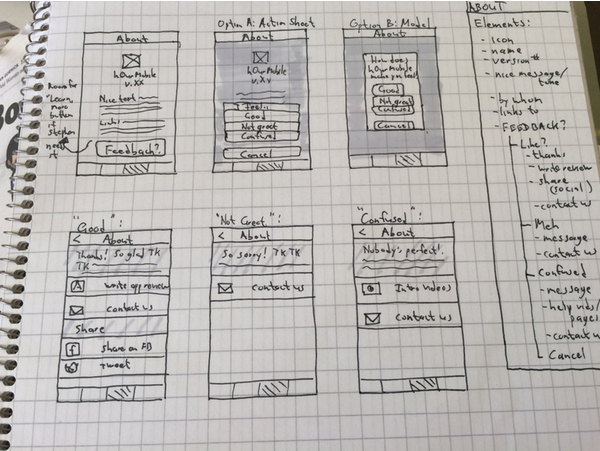
In thinking about the About screens for our mobile timebanking app (don't worry, we've done the homework and found that most of our target population of older, less techy user access online services via their phones rather than via computers), I began with the list on the right, not with the sketches on the left.

in a way, this is using UX and design thinking to help with a UX and design problem. I'm interviewing the data we have from users, and observing how the app might behave in certain circumstances.

In particular, one of the behaviors that emerged from this process was that the About screens could become a tool for feedback from users. The model of "here is where I go to interact with the app on a meta level" groups itself naturally with both "here's where I learn more about the app" and "here's where I tell the app what I think of it" (in a nice way, we hope). And the persistent goal for us is to find a way to help the users make simple choices initially, lowering the "what will this want from me?" apprehension. What I then tried was a way to offer more tailored courses of actions, rather than show all options for all users, who might have different concerns.

On the most practical level, this at least saved me from starting a screen sketch and running out of space.

(Image source: https://pixabay.com/p-707359/)

(Image source: https://pixabay.com/p-707359/)

It also gives me a first test of my hypotheses about the interaction flow. Are the screens balanced and distributed? Am I overloading one while leaving another practically useless? Do the groupings of elements make sense, now that I see them? And often the list-making makes me aware that I've forgotten something, so it's a great discovery tool.

Having made a list helped speed low-fidelity (left, Cacoo) and higher-fidelity (right, Sketch) prototyping

Having made a list helped speed low-fidelity (left, Cacoo) and higher-fidelity (right, Sketch) prototyping

Heuristics Still Have a Long Way to Go, 20 Years Later

...and by that I'm referring to Jakob Nielsen's 1995 article on 10 Usability Heuristics for User Interface Design, and how they still haven't become as ingrained as they should.

One of the things I encounter on a regular basis in my professional life is the idea that design equals "how it looks". This is not always a terrible default definition, as "design" is often about how things look (yes, of course, even color and font choices have a large effect on readability, but let's elide over that for now), but it shouldn't be the total or overwriting definition. All too often it's an uphill battle to present design as more equal to "problem solving" or "how it works". It's harder to pitch the return on investment of thinking through interaction flows than to present a pretty interface, especially to those who feel it's not something they want to spend time on.

For instance, we've had 20 years to digest and internalize the well researched precepts of what Nielsen boiled down from actual research. We do know that users find products that follow these heuristic principles easier to use and more "elegant" (we should reappropriate this term, casting it as a way to do things rather than some Apple-ish sheen), and are more likely to use and keep using said products.

Of course, some of these heuristics are harder than others to do, especially in products that gain features or are built to serve many masters. There's almost an exponential relationship between tabs or features or user goals and the work involved in making sure the product works well for the user. Nobody said it was easy to do good work.

Then again, sometimes there are examples where all it takes is open eyes and empathy for the user. As I've been known to say, "If you know how it works, you are not the user."

Case in point is the browser-based dashboard for Western Digital's My Cloud (and props to not making it "MyCloud"). It's fairly pretty, with nice, clear target areas to click on; this checks the "Recognition rather than recall" and "Aesthetic and minimalist design" heuristics. There's also some degree of "Consistency and standards" as well as "Match between system and the real world", if you take the real world in this case to be virtual storage spaces.

But these are the relatively easy targets, one you can hit with static sketches, with no testing in the real world. What happens when something goes wrong? Let's take, say, my case. All I wanted to do was plug in another hard drive and back it up. Given that I had most of my media on the drive, it took a while, so I left it to run overnight. The next morning, I found how to check the result (a tool tip for "Job Detail" is not great, but okay), but here's the Detail:

I think we can all see where this would drive Nielsen nuts.

Help users recognize, diagnose, and recover from errors
Error messages should be expressed in plain language (no codes), precisely indicate the problem, and constructively suggest a solution.

I suppose "it failed" is plain language, but in this case maybe even a code I could look up would be more useful. So I should check the system settings? Do you mean the My Cloud system settings? There are six submenus for that, each with areas within. A more useful design would let the text be a link to the precise settings feature, or there could be more text (well written text is a very useful heuristic aid). There could be a link to a log file for more advanced users to dig into. This just makes me feel dumb, but in reality the system is hiding information from me while implying I should automatically know what it means.

Ideally, if My Cloud knew that this backup was destined to fail (and I've tried running it more than once, both with the "Copy" and "Synchronize" options), it should pay heed for another of Nielsen's heuristics:

Error prevention
Even better than good error messages is a careful design which prevents a problem from occurring in the first place. Either eliminate error-prone conditions or check for them and present users with a confirmation option before they commit to the action.

The disk I'm trying to back up is not larger than the My Cloud capacity – and even Windows since NT has saved users from wasting long copying processes by running a simple free-space comparison. Is the new disk failing already? Was there data corruption? These could be simple checks, with simple-language messages, that could easily run before the user runs an overnight process.

This is starting to veer into "Siracusa reviews a toaster" territory, but this is a non-trivial problem for a relatively simple use case; we can expect users may want to back up data to the new backup system they just bought. And this is also illustrative of serious problems an elegant design can actively create for users if you focus on only a few heuristics, and the ones that pop up only if everything runs perfectly. How often does that happen, outside of a demo?


One Thing I've Been Up To Lately

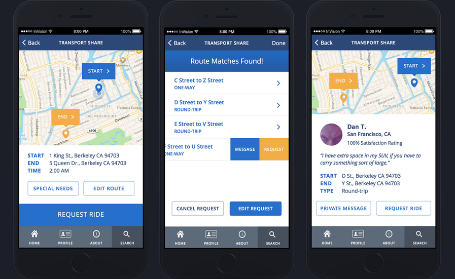
As the Interaction Designer on a team led by Victoria Bellotti at Xerox PARC, I've been working on designing and building a new app for community-based timebanking. Our initial focus has been on working with teams and CMU and Penn State to create something that's never quite been done before: contextual-based matching for local ride sharing.

A ride request, suggested matches, a ride offer

A ride request, suggested matches, a ride offer

Though ride sharing has been done (and "pseudo-sharing", wherein you pay a fee for service) to varying degrees of sophistication, our work is not only true sharing (centered in the timebanking ethos), but also bases its ride matching and recommending on contextual awareness. Given the user's permission, the app will learn where a user travels to and from regularly and at what times, while keeping this data secure and invisible to other users. This means that when another user posts a ride or delivery request ("Can someone take me to my doctor appointment?" or "I need something dropped off at the post office"), the app will match the requester to a timebank member who already is traveling roughly that route at roughly that time. It's our hypothesis that the less onerous we make it to give your neighbor a lift, the more likely you'll do it – and help grow community interactions and bonds.

We'll be testing the app (usability, QA, back end) in a closed trial this summer, with a public release to follow soon after.

Shareable on Our Recent Work and CHI Paper

In other words, one of the central debates concerning the meaning of the sharing economy revolves around motivation. What do users of sharing services really want? A group of researchers from the Palo Alto Research Center, Penn State, and UC Santa Cruz recently posed this question in “A Muddle of Models of Motivation for Using Peer-to-Peer Economy Systems,” which they will present before the upcoming CHI 2015 conference on human computer interaction. Through a series of interviews with peer-to-peer (P2P) service users and providers, the report’s authors—Victoria Bellotti, Alexander Ambard, Daniel Turner, Christina Gossmann, Kamila Demková, and John M. Carroll—uncovered a notable mismatch between users’ expressed motivations and providers’ understanding of the same.

Read more at Shareable.

Learning Pixate for Mobile App Interaction Animations

Though we've had good experience working with static screens (built in Sketch, linked into an interactive flow in InVision), there's no way to build animations and complex interactions both to test whether they'd be helpful to the user or easily comprehended by the developers (see also: prototyping is the new documentation).

So I started using the free version of Pixate (thanks, @gruber – no, wait, I gave them cash money when they were at the Kickstarter stage, so thanks me!). Here's what I was able to cobble together on the first day. The point is that maybe a pin dropping onto the map will capture the eye better, showing our usually tech-averse population that something has changed; I also hope to build this out to test different interactions of dragging the map or dragging the pin, and see which tests better with users.


Authors Alliance: I Support It, And So Should You

The mission of Authors Alliance is to further the public interest in facilitating widespread access to works of authorship by assisting and representing authors who want to disseminate knowledge and products of the imagination broadly. We provide information and tools designed to help authors better understand and manage key legal, technological, and institutional aspects of authorship in the digital age. We are also a voice for authors in discussions about public and institutional policies that might promote or inhibit the broad dissemination they seek.

It's quick, easy, and painless to join. Donate to a food back for the snowstorm, then use what you have left over to help promote authors' rights.

Learning Sketch

After going back and forth on a lot of workflows and tools, I'm going to try to use Bohemian Coding's Sketch to build prototypes of a mobile app and create the interactions our remote team can view and critique in InVision. Being a small team on a shoestring budget (hey, who says public-good work doesn't pay?), cheap or free is a great feature set.

And Sketch seems to be maturing towards being an easier (relative, not absolute) tool, and the company is including a lot of assets that'll help with app design, including automatic export of assets to 1x, 2x, 3x, and so on.

Here's my highly guided stab at making a rather gaudy icon – the tutorial was crazy with ways to use four shadows to compensate for Sketch's lack of beveling tools.

At 1x

At 1x

At 2x

At 2x


"Discipline of Organizing" is an ASIST Book of the Year -- and 50% Off!

Personal note: I'm a chapter co-author, so I'm biased. But I don't know anybody who has regretted buying and reading this book! So go get your copy with this link for a discount.

"The Discipline of Organizing has been named a "Book of the Year" by
The Association for Information Science and Technology
In recognition of Robert J. Glushko receiving a 2014 ASIST Book of the Year award, ASIST members SAVE 50% off the regular price of the new enhanced ebook The Discipline of Organizing: Professional Edition.

Ebooks and video training from shop.oreilly.com are DRM-free. You get free lifetime access, multiple file formats, and free updates. Sync with Dropbox, Drive, Kindle—your files, anywhere.

Use discount code ASIST - Deal expires November 18, 2014 at 5:00am PT, and cannot be combined with other offers."