
hOurMobile: Mobile Timebanking App
Working with Hourworld.org, our goal was to apply our research and human-centered design to create a new reference mobile application that timebanks around the world could integrate into their local community-based exchanges. Our team, which included members from Xerox PARC, Carnegie Mellon University, and Penn State University, faced the challenges of:
Build a more usable and reliable interactive platform
Build a new, top-level feature that makes it easier for users to offer and request rides, which was the most unmet user need (caused, in part, by issues with the previous app design)
Free up previously underutilized help by pushing out match requests through our new matching algorithms
Timebanks are highly localized exchanges, often at the neighborhood scale, in which members can post offers and requests; these can range from "Free shoes" to "I can offer help preparing your taxes", based on the needs or available skills of the members. An hour of work earns the member one time dollar, a non-fungible unit of exchange. That is, I could provide an hour of sewing for Member B, earning me one time dollar, and then use that time dollar to receive one hour of lawn mowing from Member C. Timebanks also foster communication and connection between people in the same area, helping towns become communities.
My Role
My overall role on this project was basically the classic "UX Team of One". Working with other researchers, I analyzed user needs and desired outcomes, studied the timebanking landscape (including evaluating the existing hOurworld mobile app), and then built and evaluated user flows on paper, in OmniGraffle, and in Cacoo; I built prototypes of new features I was proposing in Cacoo, Sketch, Invision, and Principle; I used Sketch and Invision for quick usability testing; I tested motion as a UI element using Principle.
All images shown are made by me, with the exception of the final visual design, which were made in collaboration with a graphic designer who temporarily joined out team.
Revising from the old

My first step in the process of creating a new app was mapping the interaction architecture of the existing app. This gave us insight on where to simplify features and how users would be led through them. In an early evaluation that involved walking participants though the existing app, we saw many points of confusion and frustration; we wanted to eliminate the red (dead ends, loops, and other points of user difficulty, as seen on the right – this is of the previously existing app, not our new one!).
This also allowed me to think about packaging modules of user flow, which would help speed up the design and development process. For instance, the red box around the "Add Other" seemed to be the equivalent of a subroutine or method, in programming terms.
Knowing what wasn't working, I began sketching to try to reduce the problematic parts and see what would work. This was helped by design thinking sessions with the whole team, building on our own experiences talking with and observing potential users. We could see from both our own experiences and observing users through walkthroughs of the existing app, that many essential and repeated features and actions were buried in the cryptic "More" buttons, and the buttons plus minimal labels confused users.

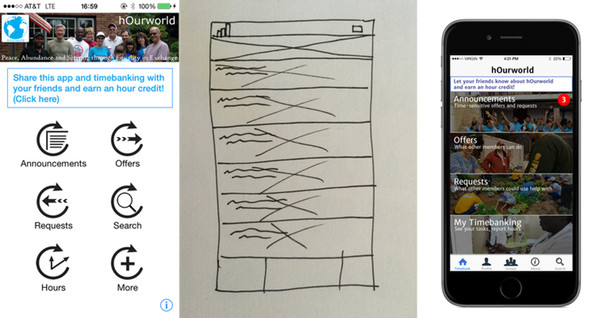
Existing app (left), initial sketch (center), Balsamiq (right)
My first design choice was to break out information-related and action-related screens; placing the former in a tab bar would allow users to access information they needed (profile settings and stats, search, etc.) no matter what actions they may be using the app to take (make an offer of action, request help, donate goods). But there was still a problem with the matrix layout – it didn't allow for easy addition of new features, nor for ways to add explanations for features (e.g., "What's an Announcement?"). Sketching it out was integral in discovering that.
Existing app (left), later sketch (center), Photoshop (right)
The higher-fidelity version helped us test whether we could integrate images of people (shown to drive engagement) with titles, notification badges, and a subhed for each feature. I took this mockup back to some of our previous walkthrough participants and quick testing showed a huge reduction in user confusion over what tap would lead to what content (unlike with the existing app, no participant was confused as to what "Announcements" would show). In addition, this tiled interface would allow for easier addition of features than a grid would.
Generating new features, based on user problems and needs
The early walkthroughs and later quick testing also gave us insight into where the existing app was leaving users high and dry. We saw that:
Long category lists and deep layers of hierarchy confounded users who wanted to browse or post Offers or Requests
Users had to go outside the app and manually keep track of what tasks they performed or help they received, from whom and how long it took, in order to report hours – a vital part of the timebanking system
The top request – members (usually seniors) needing a ride to the doctor or other errands – often went unmet, in part due to even these time-sensitive needs being buried in the information hierarchy of Requests, which required other members to search actively
All these contributed both to user frustration and a huge inefficiency in the timebanking economy: member needs were not being met.
I began working on how new or revised features could help meet these user needs.
Revised Feature: Improved Offer and Requests
For the new app (which at this point was renamed hOurMobile to distinguish it from the old app), I looked to information hierarchy patterns to find a more effective way to represent a deep hierarchy in a more usable way; we were tied to the existing hOurworld categories for Offers and Requests.

From the Offers button, layers of navigation
This put a huge cognitive burden on the users. Not only did they have to guess where the thing they wanted might be, but guess again at the subcategory level. In addition, this pattern was destructive, in that the user actions covered up their last action, and it didn't allow for users to compare. As said above, we could not change the categories and subcategories, but I made one simple change that, when put in front of participants, showed a solid reduction in frustration, reduced cognitive load, and a better emotional response. It's far from perfect, but a small change made a noticeable difference.

An accordion, with shading change. This is not final art.
A tap on a category expanded it to show subcategories – and which of those had active entries. In the existing app, users could navigate all the way down but find no Offers or Requests, leaving them to backtrack mentally. Which is no fun, I'll tell you that for free.
New Feature: My Timebanking
To address the second problem listed above, I conceived of My Timebanking as a top-level feature, providing to users an automatic list of tasks they've agreed to take on, tasks they've completed, and user-to-user messaging history. Prior to this feature, mobile and desktop timebank users would have to either remember all this data or note it down and find it outside of their timebanking experience. Early surveys and tests showed that this resulted in many users forgetting to record hours, leaving others in virtual arrears.
With the My Timebanking feature, users can track, within the same app, all this information, and see what they have or haven't reported. We have high hopes for testing this feature, though we are still to dive into the thorny issue of how to organize this information best (we plan this as part of usability testing when we get a working app into real members' hands).
Putting this into prototype also helped us explore and develop a new way to act upon information presented in My Timebanking; we also hope to test whether swiping to reveal relevant actions, as one does in Mail and many other mobile apps, is easily used by our population (which, based on our and PewInternet's research, primarily uses smartphones to connect online).

Revised sketch to test placement, taxonomy (left), initial prototype (Sketch), revised visual design showing action buttons (Sketch, with Stephanie Snipes)
New Feature: TransportShare
We could see from qualitative and quantitative research (the latter being largely server statistics) that the most-requested Request from exchange members was people needing a ride to do errands, such as get to a doctor appointment, or pick up medication from the pharmacy, or help getting groceries. Given that timebank populations trend older and less able to get around, this made sense. It also made sense that these kinds of Requests would often go unmet in the existing app: if a user worked through the hierarchy (see above), the Request would still be buried, requiring someone not only to actively think "does anyone need a ride" and look for such a posting, but do so in a timely manner.
So I proposed we pull this out to the top level of the app and create the TransportShare feature, which would be dedicated to helping users specify where and when they needed to go, what they needed to carry, whether they may need help, whether this is a one-way or round-trip request, and more, not to mention allowing users also to specify that they would be going from A to B at a certain time and "hey, anyone need a ride?"... and we rapidly found that we were having to solve for problems ride services such as Lyft didn't have to face.
What this did do, however, is open up a new opportunity and challenge. Part of our team had been working on context-aware services, which, we thought, would integrate interestingly to this feature and perhaps offer real human value.
By using geotracking (given explicit user consent, of course), we could learn more or less approximately when exchange members were traveling from approximately Point A to approximately Point B, and whether this was a regularly scheduled or one-off trip. Once this was stored in our database, if another member requested a ride that was a fuzzy match, we could push out notifications to both users (the details could be hashed out via in-app messaging, another new feature and an intentional process, by which we hoped neighbors would start a regular dialog).

Context-aware matching feature suggests ride sharing based on existing transit patterns. Final visual design in collaboration with Stephanie Snipes.
In early usability testing, participants were easily able to set requests and offers for rides, as well as cancel or edit the requests or offers they placed. So that's a small victory, given that I was testing with static screens in Invision. I'm currently exploring how motion might further draw the eye and make clear that and how the system is responding to user input.
But an interesting byproduct of my first round of usability testing led to an ethical question. As you may have noticed, the Start and End flags are not connected with a route line; this was intentional, as our app recognizes that the drive may have his or her own needs, so we do not prescribe routing. But this proved confusing for participants. I held another round of usability tests with a route line put in, verbally noting to users that this may not be the actual route – still, that false affordance reduced user worry, interaction time, and fail rate. You can read more about it at A List Apart.

Based upon our research in user needs derived from qualitative and quantitative interviews, we knew the requirements and constraints of the interaction (rides would be one-way or two-way, timing was important, a sense of safety and special needs were critical), and testing of various interaction design patterns, we prototyped and tested and built this new feature to help neighbors share and request rides.
In Conclusion That's Not a Conclusion
I wish I had more objective data on how smashing our outcomes and adoption rates are – but it is exciting to see the small, learned victories, and how it makes us iterate and improve, as well as (personal note) seeing it in early development stages as a real, live app. Though my role on this project is winding down – I'm sure there will be usability testing and thinking about refining flows and features – I'm still confident that this will be a marked improvement and bring real value to hundreds of thousands of users on a regular basis, especially among populations, such as the elderly, less tech-y, and poorer people who largely make up timebankers, who are often overlooked.