The Design of Design Links
Understanding the Kano Model — A Tool for Sophisticated Designers by Jared Spool
To be honest, I describe this model more frequently than I can remember the name correctly (apologies to Noriaka Kano; I will try my best to be better). The two-axis model can also be easily confused with a SWOT analysis, but it’s not that.
Jared makes a very succinct case on the value and quick application of the Kano Model, and it is useful when thinking about prioritization and what to explore for future design thinking.
My question is whether a short-sighted adherence to the “up and to the right” of Performance Payoff, which highly favors new and noticeable features, privileges allocating resources and focus on adding new and shiny rather than making sure what’s already there works well (the Basic Expectations), or if the new and shiny works well with the Slightly Older and Less Shiny but Established. Jared uses the example of Google Docs, and that’s what raises my question: we know that the incentives are for Google employees to propose new features and endeavors rather than fix and polish existing things. Is that sustainable?
Dark Patterns at Scale: Findings from a Crawl of 11K Shopping Websites from the Princeton Web Transparency & Accountability Project
This is the kind of vital and basic research you’re not likely to see from corporations. Though I’m not sure all of these meet the same criteria as what’s outlined at DarkPatterns.org (for instance, appealing to a sense of economy of scarcity is manipulative, but not a dark pattern), it’s amazing how many companies are based on basically shady manipulations that aren’t really to your benefit.
Accot-Zhai Steering Law: Implications for UI Design by Page Laubheimer
Saw the summary, thought, “That sounds like Fitt’s Law”, was immediately gratified by the first sentence of the article. That’s good design!
The concept of a “tunnel” in user navigation through menus and other interface elements is a fascinating one, and this article makes a good case for the real-world implications for when to use hierarchical menus, “mega menus”, and other items that ask precision of the user. I personally feel like less of a loaf-handed lump after reading this.
The Design of Design Links
What “Intuitive” Really Means by Fabricio Teixeira
Fabricio Teixeira has long been an organizer of thoughtful talk around design, and he delivers a good and quick overview of thinking about the word “intuitive”. I was once at a Product Tank talk by a tenured CompSci prof with a Ph.D. in psychology and a well meaning student asked, “What do I do to make my product intuitive?” The prof earned his pay right there by being patient and walking the student through her preconceptions about what that word meant. Does she know how to drive? Is that intuitive? Fabricio similarly moves to reframe the requirement towards something that aligns with how humans work and how designers can build.
4 Steps for Choosing the Right Projects for Your UX Portfolio by Sarah Doody
Big fan of Sarah. And I should read this until I see it on the inside of my eyelids. Of course, you may not have more than four projects, or you may dread revising your portfolio even once.
77 Words UX/UI Designers Use by Johny Vino
Reminds me of the “Shit Interaction Designers Say” video, which actually looks fairly benign compared to how reality has shaken out.
The Design of Design Links
How Not to Apply for a Design Job by John Freeborn
A nice high-level introduction for some, reminder for others, of some basic behaviors and strategies when applying for a design job. There are definitely some balancing acts involved, such as when Freeborn describes some overly aggressive job seekers; this needs to be balanced against the coaching I’ve seen young designers receive to promote the crap out of themselves, to the point of walking up to strangers with an “I was obviously the best in my bootcamp” statement (this really happened).
The Warning Label that Should Come with Venture Capital by Founder Collective
Punting for now the question of whether venture capital is a beneficial model for anyone other than a few investors (hint: like most casino models, probably not), if you’re a designer at a startup or other company that’s seeking or relying on venture capital, this is a good start on how to keep your eyes open and ask questions. Remember, as a designer, asking questions is fundamental to your job.
The Journal of Future Studies
Pretty much what it says on the tin. Even if a topic isn’t your obsession, there’s a lot of walking through of very competent thinking and issues that’ll help you conceive of how your work might affect the world – for good or for ill. Recently, Bill Buxton made the point that design in tech is unique – to its detriment – in not learning what was done in the past. Architects learn the history of construction and buildings, doctors learn how we learned “don’t tug on that” during surgery”, but digital designers are given 12 weeks and never look back into what mistakes have been made, what lessons have been learned.
Nooooo Idea
So, running into computer problems. This looks like a good learning opportunity for looking at how the content of diagnostic tools and error messages are designed.
There had been some slowdowns and general weird moments, so I tried to run Disk Utility. First time, it seemed to freeze my computer. So I rebooted into Safe Mode, ran fsck -fy (just because) and saw:
Booted up, ran Disk Utility again, got:
And I noticed that after that, things like screen shots aren't showing up in the Finder, and when I try to delete items, I get:
So, what does any of this mean? How can a not-super-technical person make sense of this mess?
First, these issues seem to be unrelated, but I am only inferring that due to the omission of any mention of the two together. Can't blame docs for that. Also, digging in a bit, it seems the first might be related to Time Machine backups and a possible bad block, while the latter is a mystery nobody seems to know the cause for.
Unfortunately, both issues seem to involve rebooting and doing arcane things (the first, entering some precise text; the second, resetting PRAM which is usually the equivalent of shrugging "dunno"). If you don't hear from me again, this is why.
Sketchday Day 14
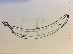
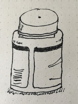
I suppose I should actually go look up techniques and practices for using shading to show depth and shape but someday.
What did you sketch today?
New Wheels
The A Force wheels arrived (built by Prowheelbuilder.com in the U.S.) and the quality and weight look not bad. Though I'm not sure what I should eyeball to check. Not my scale, not my garage, so take data as from a single source. And this is with no skewers, no rim strip, no valve, no cassette, etc.
Sketchday Day 13
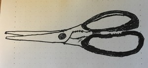
This is what it looks like when you reach too far and try to draw a whole room, realize you've gotten perspective all wrong, and quickly move to "can shading show highlights on metal", and realize you're no Jack Kirby.
What did you sketch today?
Sketchday Day 11
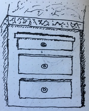
Shading for perspective is still hard. Not sure whether to try for single-line or sketchy line.
What did you sketch today?
Sketchday Day 10
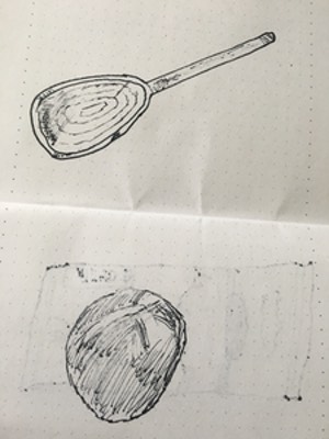
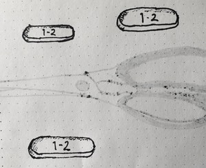
I don't know... can you even tell what these are? Was trying to reinvent (guess I could have looked up the info) how to show depth with shading.
What did you sketch today?
Sketchday Day 9
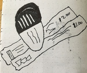
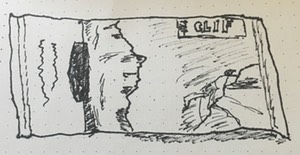
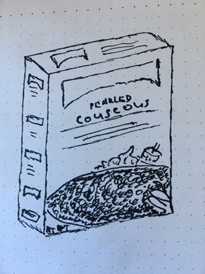
I'm not sure how to convey more of the lumpy 3D nature of the package sitting on the table. Thoughts?
What did you sketch today?
Sketchday Day 8
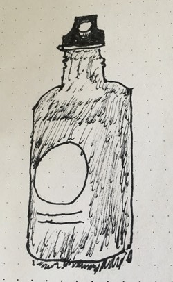
It's tricky, trying to get a simple shape that's a color with highlights, and perspective. Note that this is ibuprofin and I needed to take it.
What did you sketch today?
Sketchday Day 7
What happens when it's late and your eyes are bleary but you go ahead anyway.
What did you sketch today?
Sketchday Day 5
Sorry for the late start! I'm focusing on placement, perspective, and trying to get a more sketchy line and see how that feels.
What did you sketch today?
Sketchday Day 4
Keeping it relatively simple, to focus on seeing the lines of a 3D object, a bit of texturing. Trying a complex, shiny shape yesterday was a step too far at this point.
What did you draw today?
Sketchday Day 3
You've all been uploading such fantastic sketches. Is doing one a day helping? What do you go about doing to get the sketch? Is there anything you've learned that you want to share?
I started on sketching a shiny sink faucet today but totally turfed the curves, perspective, and how to show dark and shine. Funny how when you start to follow a line and then think, "there's no way this can exist in 3D space."
Sketchday Day 2
Experimental results: confirmed that perspective is hard, and that one has to plan ahead for showing highlights on shiny surfaces both dark and light.
What did you sketch today?
