An "I'm living in the future" moment, #latetotheparty edition
Two little devices that have shown up in my life recently both gave me "wow, this is what the future used to promise" reactions. I know I'm late to the party on the technologies that drive these doodads, but bear with me; I'll try to explore what fundamental delight-and-surprise elements triggered my reaction and the design lessons we can take away and apply to upcoming, more cutting-edge projects.
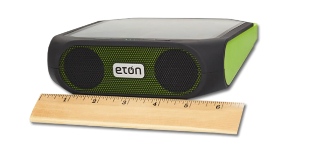
The first device was the Eton Rugged Ruckus , which my local NPR station was touting pretty constantly throughout their recent fundraising drive. The company describes it as a "solar-powered, Bluetooth-ready, smartphone-charging speaker" (mine came without the lime green accents).
It's fairly rugged, and pretty Ruckus
From a previous KQED membership contribution I already have one of those really fun crank/solar-powered radios/phone chargers/sirens. (That siren is loud; don't hit that switch by accident.) So the alternate power source wasn't the, um, source of my future shock.
That came when the Bluetooth connectivity turned out to be so transparent and good as to be almost magic. I've avoided Bluetooth stuff for logical and emotional reasons; the former being that I knew it didn't work as well as the promised "Bluetooth low energy" , the latter being not wanting to be That Guy talking in public into his douchey ear decoration.
But once you've paired the Ruckus to your computer or phone (in my case), you can use either an AirPlay control on your phone or a button on the Ruckus to toggle streaming of any audio. It's really not any different, carrying the Ruckus around versus carrying your phone, but it's all invisibly streaming and therefore magic.
What's the design principle here we can leverage, going forward (to co-opt how marketing and MBA has corrupted an otherwise pretty good language)? First, leverage familiar affordances: the user controls selection and playback through the iTunes or iPhone (or whichever media player), so nothing new to learn that gets between you and your Savage Lovecast). Second, make informed, reasonable decisions about what should happen when users push non-control buttons: if users turn on the paired Ruckus while playing music on the phone, there it is on the Ruckus; if users turn off the Ruckus, the music stops (instead of playing it on that thing you left somewhere else). The new device becomes a one-button extension or proxy, rather than another damn thing to manage. Again: therefore, magic.
(One potentially complicating option I'd like to see would be a control to turn off or on phone interface sounds when it's streaming to the Ruckus; alert sounds might be a good thing to "always stream", but not the tappy-type of keyboard feedback. Especially since now the sound is coming to you from device other than the one you're typing on.)
The other device is a Garmin Edge 500, which I picked up used from an old schoolmate. This is my first GPS-enabled device aside from my phone. Nope, I haven't even used a rental car with a navigation system.
(Actually, now that I think about it, that's not quite true. Of course our phones today have GPS, and we use that to locate ourselves and map routes. I'm not sure why that never seemed as futuristic; perhaps we think of it as simply a piece of mobile web browsing.)
Perhaps what made the Garmin Edge to FUTURE to me was that I have dealt for over two decades with bike computers that require wheel or crank magnets and pickups, with wiring that snakes over a bike frame. In fact, back in the Avocet days, it was a critical matter of style whether you coiled the cable clockwise or counter-clockwise up your fork and brake cable. A case in point is the installation instructions for a simple, low-end Cateye bike computer:
Lower-tech can mean more tech for the user
In comparison, here's the entirety of the hardware you need to put on the bike for the Garmin to work:
Bike not included
(Plus the BarFly mount, sold separately. More future: the BarFly is made from Delrin, and I think it's 3D printed, IIRC. By a company in Sausalito.)
I'm sure my personal future shock was at least partially due to the man-weeks I've put in over the years of aligning wheel magnets and threading cabling; my training buddies laughed when I was visibly amazed that "it just knows I'm moving and where I am!" reaction. Of course, aside from those moments when it didn't because some pesky tree or cloud got between me and a satellite. (See? My bike was talking to a satellite! Tell me that's not the future we always imagined.)
What's the design principle here that can be our takeaway (again, MBAspeak)? At least: it can take a lot of tech and implementation to reduce the tech and implementation you leave incumbent to the user, which makes for such a better user experience. There's always going to be someone who'd rather pop the hood and adjust a carburetor for that optimal ignition, or the open-sourcer who is happy to recompile the kernel for each application installed, but if you can allow me to just get on the damn bike and ride, I'm more likely to appreciate the experience.

