Campagnolo, Logos, and the Jet Age
/Christian Annyas is, apparently, a bike as well as typographic geek. On his blog he takes a look at jersey design and component logos in the most recent Tour de France. How did Christian know how to entice me with two of my favorite things? I will admit to being a bit confused by his judging that this year's jerseys are "possibly the best designed of all time." This is in part because he savages most of the designs while the few he lauds... well, I just don't see Leopard-Trek as particularly good layout and color. Granted, there are none of the truly weird designs of the past such as the Carrera bib shorts or the not-so-slimming-stripes of Atala (one year they were helical like a barber's pole), but the class of 2011 seem to diverge between carelessly gaudy (Saur-Sojasun, I'm looking at you) and plain (Team Radioshack and, again, Leopard-Trek). Team Sky does manage to pull off the understated, in part because of the black base but also, I think, due to the higher placement of the green band; this means the black flows over the breastbone-to-belly area, which is problematic when most people are in a proper cycling position. In contrast, the Leopard-Trek jersey just looks like it gave up at some point and lacks balance. I agree with Annyas on AG2R La Mondiale, BMC, and Garmin, but three good design solutions out of 22, with a few in-betweeners -- would your company take that as a win?
But what I want to get to specifically is the Campagnolo logo, as it changed between 1960 and 1974. I'd love to Christian to address this (and the other logos), because I'm sure he could add comments that would be a hundredfold more historically and typographically insightful. I'd also love to hear from any people with experience in this area.
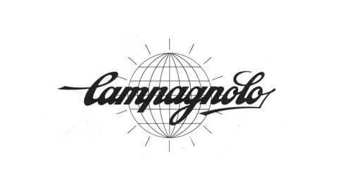
Let's look at the 1960 version:
 The image Christian found looks to be a slightly decayed sample, or scanned off of a porous surface such as a cardboard component box; an older but cleaner version can be seen on the Velo-Retro site (it's to Christian's credit that Google searches for "Campagnolo 1960" returns his site pretty high up in the results). So we can see that the radiant lines around the globe and the letter shadows aren't meant to look distressed by design (though that may have been how most people saw it on shirts, boxes, paper, given the print technology of the day). But the logo does look to be of a time: I look at it and see a newspaper masthead or a movie studio sign from a day when men wore hats and women wore gloves. The globe signifies "worldwide", but at that time travel was hard, the world as a whole wasn't accessible, and so the idea of seeing the globe as a whole was new, like a rising sun.
The revamp Christian next shows has a vastly simplified globe (still with latitude and longitude lines), fewer rays, and no drop shadow to the lettering.
 I don't really feel qualified to comment on the font change -- there's a slight modification of stroke width, letter height, and something new with the "g" -- but the overall sense is one of lifting off from layers of cruft, of more abstraction from the earth, which is by 1974 something everyone has seen from satellite photos. What else has happened? Two words: Pan Am.
In 1957, Pan Am moved from a "globe and wing" logo to the modern version (some images and unverified background). You can see a possible influence on Campagnolo's later change in the stripping of real features from the globe, the recognition of recognition of the planet as an icon. Pan Am's influence around the Western world was deep and wide: its modern HQ broke the Manhattan skyline in 1963, and even before Apollo 11 Pan Am was seen as the logical way to get into space (note: the historical "Clipper" or Orion Space Plane is currently in collection at the Sci-Fi Airshow).

 Of course, chronology does not mean copying. The point I mean to make is that it could be that similar influences and perceptions led Campagnolo towards a certain direction. Years passed between Pan Am's major redesign effort (which included years of research) and Campagnolo's simplification. In fact, I'm asking all of you who know more about design work from that period to chime in.
And this isn't to say Campagnolo was full speed ahead to the Space Age and modernist design. These two designs for frame stickers are dated by Velo-Retro as coming from 1953 and 1967. Both seem to use the pre-1970-redesign font, though the latter seems to have done away with the longitude lines, probably due to the small size of the sticker, which was to go onto one or more of the tubes of a bike frame. Both have the World Championship "rainbow" colors across the globe, though.
And how did Campagnolo move into the future past the Space Age, post 1970s? By simply abstracting out the globe entirely. The brand isn't just worldwide, it is the world.

