Grinding Down to an Icon
Sometimes icon and logo design comes together in a flash. This is not one of those times.
For this app icon, we had certain elements that had to be carried over from a previous version (by request of that app's originator): a globe, a certain blue, the message of community and sharing. Here's the icon for the previous version:

The original, or where we came in.
I began by taking value words from the hOurworld web site and various correspondences I had with the founders and made a quick mind map to help me think about images and messages the icon should, ideally, present to users.

It seemed the existing globe was too grounded and took up the entire focus – does this more say it's about mapping? Not to mention that this might favor one part of the world over others, when the app is for use world-wide. (Of course we didn't need the app name in the icon design itself.)
Sketches and iterations juggled types and placement of the figures you'll see below, and attempts to balance their size against that of the new globe. A few layers of color and gradients were adjusted to try to give enough contrast for viewing in all lighting conditions, or for users with poor vision.
We're still working on it, and welcome comments. What does it say to you?

After looking at it at icon size on a phone, it seemed that though the character images did expand on the mission of the app, these images could be too small to be read clearly by our (older, non-tech) population. So back to a more abstract design, this time checking out a long shadow to imply some dynamic action, which might not make the icon look solely about a globe qua globe, but the globe as a site of some action.

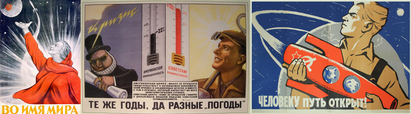
And it's as if the whole world were looking up and to the left, into the light. That's not an uncommon pose to help signify hope and the future. I feel I've seen that sort of thing somewhere before.