

Wireframing: In Praise of Lists
/Wireframing is sexy, right? The word is on almost every UX job listing, and conjures up images of carefully curated hip clothes, chunky glasses, open offices with light and whiteboards and gourmet lunches and yoga.
Lists? Not so much. They don't require special pens, templates, special paper (though sure, you can fill a Field Notes or Moleskine with them if you're so moved), and they don't convey "design" visually the way boxes and arrows do. But I've found them to be an important step in the design process, helping me to save time and fix issues with a wireframe before the Sharpies or Copics ever come out.
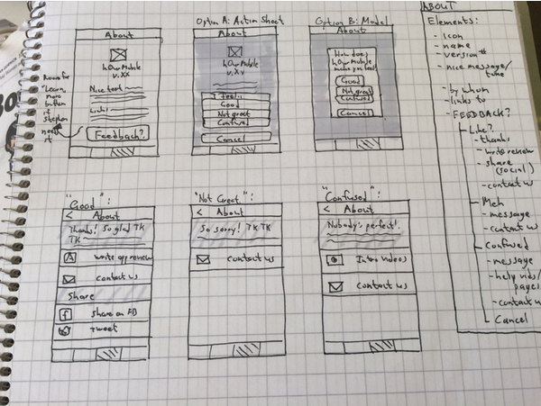
In thinking about the About screens for our mobile timebanking app (don't worry, we've done the homework and found that most of our target population of older, less techy user access online services via their phones rather than via computers), I began with the list on the right, not with the sketches on the left.
in a way, this is using UX and design thinking to help with a UX and design problem. I'm interviewing the data we have from users, and observing how the app might behave in certain circumstances.
In particular, one of the behaviors that emerged from this process was that the About screens could become a tool for feedback from users. The model of "here is where I go to interact with the app on a meta level" groups itself naturally with both "here's where I learn more about the app" and "here's where I tell the app what I think of it" (in a nice way, we hope). And the persistent goal for us is to find a way to help the users make simple choices initially, lowering the "what will this want from me?" apprehension. What I then tried was a way to offer more tailored courses of actions, rather than show all options for all users, who might have different concerns.
On the most practical level, this at least saved me from starting a screen sketch and running out of space.
(Image source: https://pixabay.com/p-707359/)
It also gives me a first test of my hypotheses about the interaction flow. Are the screens balanced and distributed? Am I overloading one while leaving another practically useless? Do the groupings of elements make sense, now that I see them? And often the list-making makes me aware that I've forgotten something, so it's a great discovery tool.

Having made a list helped speed low-fidelity (left, Cacoo) and higher-fidelity (right, Sketch) prototyping