
Design is Tradeoffs, but Adds Value Faster than Costs
A great essay by Joel Spolsky, who knows firsthand that design isn't just making something work, or making it pretty, but balancing real-world constraints to build something that works best for the people who actually use the result of the design.
Actual Job Listing in the World of #UX
Highlights include:
Actual illegal age constraint (hel-looo, EEOC)
Buzzword compliance, while demonstrating lack of understanding of said buzzwords
Contradictions ("It's ok if you have little or no experience in UX/UI" followed by "User Experience")
"Vision"
Actual listing below:
"Introduction:
We have a vision for our early stage startup but we need help completing it. That’s where you come in. Help us discover our identity, define our brand, and ingrain creativity into our culture.
Who we’re interested in:
Someone 20’s or 30’s
It’s ok if you have little or no experience in UX/UI - we’re looking for people with an eye for design
Willing to learn what he/she does not know, willing to adapt to startup life
Skills
Able to execute (draw/wireframe/sketch)
Able to identify good design and user experience and reproduce
Able to communicate their ideas
Someone who will be a core member of the team
Establish design as a core value of the company
Potential co-founder
First hire
The idea is, it won’t be full-time right away. We want to do some trial projects together.
More of a multi-project relationship
Keep the relationship alive
Someone we get to know really well
Big design efforts
Small experiments
Have someone in the room who is very focused on the user and experience
Optional part-time arrangement. Ex: 2 days per week, 15 hours per week, etc.
Full-time after a few successful projects together
NOT interested in a unicorn
Unicorn = someone who can do everything (coding, design, user interface, etc.)
NOT the most expensive, amazing, world-class designer
We are still pretty young and have time to experiment with several ideas, so a branding expert who charges $5k per project might not make sense
Someone who advocates for the user
Current team members are focusing on many different things
Scott - data and code
John - product and fundraising
Designer?? - focus on the user
Personality
Hungry
Motivated
Willing to go in new/diff directions. Perhaps the person is well-versed in Photoshop, but does not know a whole lot about iterating various UX techniques. However, they’re eager to learn.
Understands or is passionate about what we’re doing
Super geeky. Is really, really into X.
X could be:
photoshop, fireworks, etc
User Experience
Wireframes (Balsamiq)
RoR
Etc
User Context
We spent some time defining who we think our user is. We put this information in the Context doc.
Other Website Evaluation
We have done some exercises on ‘what makes good design’. We put this information in the Website Evaluation doc."
Whoa, Fortune, Got Some #UXfail in your CSS
Looks like some CSS/Javascript (probably about the scroll bar's visibility) is disrupting the reading experience.
#UXFail, Google+ Edition
No really, I just don't get it. I saw this in two browsers, latest Mac OS X version and updated browsers.
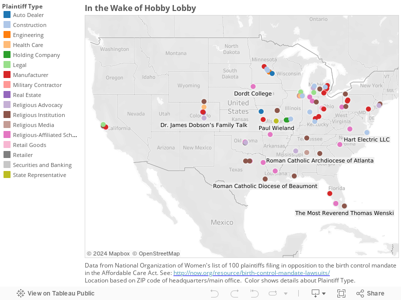
#Dataviz: In the Wake of Hobby Lobby
(Note: One slightly odd feature of Tableau was the lack of scroll bars. Click and hold for a while if you want to drag the map.)
New @Medium Piece: Down and Out in Online Reviewing
Because I'm having fun making header images, thought I'd write something else this week. Hope you enjoy it; you can find it here.
New @Medium Piece: How Startup Founders Can Be Like Iraq Warhawks
You can read it here. And remember, recommendations on Medium are really helpful! Thanks in advance.
#UXFail, Google Drive Edition
First, we see a turn arrow next to the "My Drive" text. Normally, in almost every OS or UI, this signals to the user that this is a control on which they can click, and which click will effect a change in the UI: most usually reveal another level of the information hierarchy. (The canonical example is in List View in the Mac OS Finder. Go ahead, try it now; I’ll wait.)
In this case, I clicked on it, because the principal investigator on our project said she has a file she wanted us to see in a subfolder on Google Drive. I heard "subfolder", so I (not unreasonably, I thought) tried to navigate to what looked like it’d be a subfolder, by clicking on the turn arrow.
As we can see in this video, clicking on the turn arrow does indeed turn the arrow. But that’s all it does. And then clicking on it again does nothing. The turn arrow remains in the "I’ve progressively displayed information" without ever having done so, and remains so smug in its certainty that you can’t unturn it.
Then, on a whim, I click on My Drive. To my surprise, this changes the information shown to the right. It’s fun to note that this breaks the interaction pattern of the Gmail web interface, where the Inbox view is the default view and clicking the top menu item, Inbox, shows that info. So, what was I looking at when the page first loaded? How do I get back to it?
So I click on "Shared with Me". That actually shows some of the files the PI was asking us to look at. Apparently, the mental model in the people she shared with — a separate information category — was not the same as what she saw — a subfolder.
But anyway, how do I get back to the stuff that was on the page when I logged in? My Drive? Nope. That control? No, that’s to upload files, not move up in the hierarchy (whatever that may be).
The Back button in the browser? Give it a try and what the hell? What is this "Activity" screen? (Note: I could not reproduce this, which is itself worrisome for QA.) Let’s try Back again. Okay, we’re back to where we started. Whew. Now about that turn arrow… nope. Still smug. I just must not get it.
MPICT.org Slides are Go
The one-week intensive for community college instructors was fun and educational for both the participants and, well, me. We in this field of UX, to a degree that's so sad as to preclude irony, fail to research and be aware of the needs of so many of the students in the world. They don't have the luxury of choosing to be "a creative"; a class in the basics of Excel may enable them to get a job in data entry and that's a happy step up from their circumstances.
So what's not shown in these slides, which I would add were I to teach this course again, are vocational points, which I tried to incorporate on the fly. These include: you don't need to be "in tech" to work in UX; which process I covered could be careers in themselves (e.g. user research, usability testing) and what skills students would need to develop; various educational interests that translate well to careers (e.g. psych or sociology).
In any case, to make it easier to step through the slides, here are links in order or presentation. For some reason SlideShare doesn't offer a "list by name" option.
Module 01: Intro and Definitions of UX
Module 05: Personas and Scenarios
Module 08: Responsive Web Design
Overall, it was a great experience, I hope for everyone involved. I'll soon post photos and screenshots of what the participants researched and built in just a few days.
Lack of Updates Can be Fatal
Apologies for the radio silence. I'll try to synthesize what I've learned about this week of UX intensive. It's true; having to explain what you think you know really highlights where you need to learn.
Its like one one point I've been reiterating in class (which is to community college instructors, whose students are most concerned about what they see as a job market that's impossible to break into): a large part of our job as UX people is to communicate. Every design artifact, every research finding, has also to be a communication tool. You have to be able to explain what and why at every step.
Quick #UX Hack: The Ultimate Interface
On a recent iMore podcast, Rene Ritchie suggested that his ultimate interface would be "a big red button that says 'Do It'."
Well, red is probably a confusing color, in cognitive terms, to associate with a positive action in most modern cultures. But it was an interesting idea. So I modified it to comply more with what we know about human perception and interaction design and iOS interface standards. That includes buttons that are just text.
#UXMeme: Users and Usability
Jumping to the penultimate module of the upcoming MPICT.org class.
#UXMeme: Do Not Interview Users Like This
Having some fun with slides for upcoming UX intensive for MPICT.org
#UXMeme: Familiarity as a Design Principle
Slides for teaching a one-week UX intensive for MPICT.org.

Teaching at MPICT
Looking forward to meeting my students.
(Teaching a UX/UI Intensive in the last week of June for the Mid-Pacific Information and Communication Technologies (ICT) Center.)

Flashback: Duke Nukem 3D Review
For reasons too irrelevant to go into here, I ended up on an Amazon page for the 1999 Mac port of Duke Nukem 3D (now only $84.99; nostalgia is costly). And some of the language of the review looked familiar... holy crap, that was me, 15 years ago.
Sure, it's crude. Sure, it could be called sexist, and sure, a good part of it seems designed by socially backward fourteen-year-old boys. Still, once you get past a few distasteful points (such as Duke's steroid-induced buffness), Duke Nukem 3D offers a fast-paced respite from the DOOM-and-gloom tone of most first-person shooters on the market. It's hard to hold a grudge against someone who grumbles, "It's time to kick ass and chew gum, and I'm all out of gum."
Is there a plot? Not really - there's just a premise, and one so thin that it might not even be pitchable to a Hollywood producer. Seems a bunch of aliens have descended on Earth to "steal our chicks," as Duke so delicately puts it. It's up to you, as Duke, to save the day by, basically, shooting everything that moves and a few things that don't.
Anyone familiar with this genre of games will be instantly at home. In between killing aliens, you have to collect security cards (think keys from DOOM), which allow you access to various parts of a level. You finish a level by making it to the Self-Destruct button (how you can win by blowing yourself up is beyond us, but hey, Duke works in mysterious ways). There are some puzzle elements to each level, but none too tough for one who's made it through Marathon.
Speaking of Marathon: inevitably, comparisons will be made. Build, the graphics engine behind Duke Nukem 3D, is still a "2 1/2-D" construct - not truly 3D. However, it does allow more 3D-like effects than the Marathon engine, such as crouching, jumping, ramps, and multistory buildings. There's even a submarine you can board, and a subway car. Also, Duke's world is far more interactive than Marathon's. Phones have dial tones, vases shatter in a cross-fire, windows break, and when you come across a pool table you can roll the balls around.
Still, there are some areas in which the Marathon series retains an edge. Swimming and flying in Duke Nukem 3D is downright boring: You move up or down, and stay in one place without bobbing or sinking. There's also no mystery at all in Duke Nukem 3D. Shoot, watch the gore, run on. The ingenuity of some levels, and some honestly funny parts (besides the alien on the toilet, I mean) do entice you to play on, but there's little to go back to and try to understand. Then again, nobody's selling this game as a replacement for graduate studies. And, make no mistake, Duke is fun.
MacSoft and Lion are to be congratulated for the quality of this port from the PC world. Installation was a breeze, and Mac interface conventions (such as selecting menu items with the mouse, dialog boxes, and menu bars) are all there. But wait - there's more: The Mac version of Duke Nukem 3D offers more value and more features than the PC version did. You get levels that PC users had to purchase separately as the Plutonium Pack, including a great level set in a fast-food joint. Also, "MacDuke" takes advantage of some of the Mac's multimedia features, allowing you to switch screen resolutions on the fly (I know you can already do that, but PC users can't) and record taunts in your own voice for multiplayer games. One tech tip: If you find that the game suffers from occasional momentary freezes, try turning off the Music option - the freezes are most likely caused by the computer accessing the CD-ROM music tracks.
Speaking of multiplayer games: Duke Nukem 3D's Dukematch features are impressive. Not only can you play over a local network, you can play against one to seven enemies over IPX, AppleTalk, or TCP/IP. Head-to-head play over the Internet required only getting a competitor's IP address and typing it in to a dialog box. With a 28.8kbps modem, play was smooth and almost as good as over a local network. Duke Nukem 3D is even cross-platform networkable, so you can go kick some PC user's behind, whether locally, or across the world. One warning: unlike Marathon, Duke Nukem 3D won't send a map to all the players, so if you plan to use a third-party map, you'll have to email it to all your friends (the good news is that Duke map files work on both platforms with no modifications necessary and there are a ton of gamer-made maps available on the Web).
For parents, there's a password-protected "Parental Lock" option (in the Options menu, or course). Once you set this lock, your kids will be protected from some of the more explicit violence and "adult themes" in Duke Nukem 3D. Then they will be free to run around and shoot things to their little hearts' delight.
Speed was excellent (16-28 frames per second on a 800-x-600-pixel resolution) on a Power Mac 7600/120. On a 68040-based Mac, you'll need to reduce screen size and detail, but the game is still playable. Overall, the Mac version of Duke Nukem 3D is an impressive achievement technically, and, though you might feel guilty enjoying it so much, you probably will. - D. D. Turner
Good News: Fast action game with a specific sense of humor. Great weapon variety. Good network play. Excellent port.
Bad News: Possibly offensive sense of humor. Chunky graphics. Must have CD in drive to play.
Rating:3/4
©1999 MacAddict -- From MacAddict -- Subscribe now!
Latest #dataviz: Shaving Times
Collecting the data took longer than I'd thought; waiting four to ten days between data points adds up. Data collated in Excel, visualized in Tableau Public.
