New Book: The Discipline of Organizing

Chapter co-author of this UX textbook edited by Robert J. Glushko.

Buy it at Powells.com!

"Organizing is such a common activity that we often do it without thinking much about it. In our daily lives we organize physical things--books on shelves, cutlery in kitchen drawers--and digital things--Web pages, MP3 files, scientific datasets. Millions of people create and browse Web sites, blog, tag, tweet, and upload and download content of all media types without thinking "I'm organizing now" or "I'm retrieving now."

This book offers a framework for the theory and practice of organizing that integrates information organization (IO) and information retrieval (IR), bridging the disciplinary chasms between Library and Information Science and Computer Science, each of which views and teaches IO and IR as separate topics and in substantially different ways. It introduces the unifying concept of an Organizing System--an intentionally arranged collection of resources and the interactions they support--and then explains the key concepts and challenges in the design and deployment of Organizing Systems in many domains, including libraries, museums, business information systems, personal information management, and social computing. Intended for classroom use or as a professional reference, the book covers the activities common to all organizing systems: identifying resources to be organized; organizing resources by describing and classifying them; designing resource-based interactions; and maintaining resources and organization over time. The book is extensively annotated with disciplinary-specific notes to ground it with relevant concepts and references of library science, computing, cognitive science, law, and business."

The Discipline of Organizing, available now!​

#LowHanging: Modest Proposal for iTunes List View

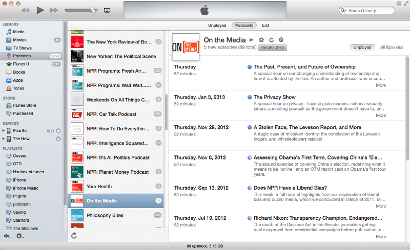
I live in List View in iTunes. This is because most of my iTunes interaction is with podcasts, which I listen to while commuting, riding my bike, cooking, etc., for many hours a week. My user story involves refreshing my podcast collection each day, noting (in the Downloads window) what is new), selecting and transferring podcasts to a playlist on my iPhone, and arranging the playlist.

With about 1200 podcasts downloaded, and about 25 lines of listing available per "screen" on my laptop, that's 48 full screens of podcasts to look through (if a "Next Screen" function were available). Scrolling is the default solution, either by trackpad, the thumb scroll, or scroll wheel on my mouse. (Note: searching is not a good option, because you cannot search for "newest" episodes and you might want to discover older episodes.) Scrolling is visually tedious, and produces two problems: "getting lost" and losing visual distinction between podcasts and episodes.

Losing one's place in the list happens because scrolling rapidly enough to make progress through the list results in visual "blur", which leaves the user uncertain what just went past and if parts of the list had been skipped. It's hard to demonstrate in still images, but give it a shot and you'll probably experience this. One major reason for this is that the blue dots on the left dominate the visual field while scrolling. They are the most saturated and boldest (to misuse the word) element in the list, and anchor the user's eye to an almost solid border of blue hard on the left when the user scrolls. Even if the dots don't appear or are half-filled (indicators of episodes half-listened to or not downloaded), it takes many to overcome the solid blue line. And the checkboxes reinforce the problem. The text is simply overwhelmed in motion as the eye tracks vertically, rather than horizontally with the text. The result is often frustration.

(Note: There's no good automated way for me to set up a podcast playlist that I change regularly. iTunes does have a feature for syncing latest episodes of podcasts, but that's not a real solution. Many of the podcasts I listen to have years of archives, some have episodes I'd rather skip, and some are defunct but still worthwhile.

Some of the podcasts are time-sensitive (Talk of the Nation, Political Junkie, To the Point, Real Time, and other news) but most are not (This American Life, Wait What?, 99% Invisible, the SpoolCast, On the Media, Commonwealth Club, and many others). What this means is that before I go out on the bike or to commute, I go through my podcast library, which I update every day, and pick and choose what I want to listen to. As implied, this could be a mix of recent news (The Political Scene),  a fun piece of entertainment (By the Way), or archived knowledge (Boxes and Arrows, the Nitch, City Arts and Lecture) that I'd like to learn.)

The Podcasts view just doesn't work. If you want to load a playlist with episodes from multiple podcasts, that requires click (on podcast), drag (episode to playlist), scroll to other podcast title, click (to load its episodes), drag. There's also much less information per screen, aside from the count bubble next to podcast titles, which isn't in List View.
The iTunes podcast view

The iTunes podcast view

So I use List View. Which has its own usability issues.​

​iTunes List view

​iTunes List view

The elements mentioned above also deep-six any chance of using the podcast titles (I'm using "podcast" to mean the whole collection of podcasts: "KQED's Forum", for example) as landmarks. Many times I've been looking for an episode of one podcast, scrolled, and wasted time going through the list of episodes from a different podcast. This also results in frustration.


I suggest three possible tweaks that could mitigate these problems and reduce user frustration: indentation, shading, and bolding.

Indented iTunes List View

Indented iTunes List View

Indentation is a common mental model for hierarchical organization, a model reinforced by word processing, outlining, and presentation software. Apple, in fact, makes that kind of software. This presents breaks in the wall of blue dots and could make locating oneself much easier even when scrolling rapidly, and note where one podcast list ends and another begins.

Indented with shading

Indented with shading

This indentation could be reinforced with shading; this is a useful visual differentiator in wireframes. Though the opacity here might be a bit dark.​

Colorized podcasts

Colorized podcasts

Alternately, the podcast titles could be highlighted, though their relative low numbers could invite visual confusion with them being selected (while the episode areas being shaded looks more like an area).

Bold those podcasts

Bold those podcasts

The titles could also be in bold or a larger type; this would also work with standard hierarchical representations from other types of software.

Testing would be key, of course. A/B testing could be set up between any two of these options, and combinations (bold podcast+indent v. bold podcast, etc.). This would give hard data whether any one or combination results in some improvement in usability — reduced "scrolling past", quick location of podcasts). I can't guess how many users for testing this would require, but even a handful would give important feedback.

And also of course, too, Apple is not known for doing usability testing outside of its own labs. Therefore, to sell this idea to Apple, the best path would likely be to show data that there is a significant issue for user with the current design, and couch the data for our best solution in aesthetic context (I do think the indented version looks better in addition to likely working better).

Thoughts?​

SNAPMapper Takes Third Place at Alameda County Hackathon

SNAPMapper home screen SNAPMapper, our mobile "Yelp for food stamp users" app, took third (out of 24) at the Alameda County hackathon last weekend. There was a fantastic amount of creativity and great ideas, all geared towards improving services and access to services for the residents of this huge urban and suburban area.

Currently, people on the state CalFresh and Federal SNAP food assistance programs can find only the location of stores that accept this payment service; the data says nothing about quality, service, availability of fresh food, etc. (that is, the nearest three places may be liquor stores and gas stations). SNAPMapper allows users to locate, rate, and give other feedback about these stores, helping all users learn where they can find healthy, fresh, and inexpensive food for their families. We also hope that this would provide incentive for stores to stock healthier food.

(Our research confirms that a majority of the population in question has access to a smart phone; these phones may, in fact, be their only source of internet access.)

Our data can easily be scraped for the county to match against its own demographic data about CalFresh and SNAP users, to track the efficiency and availability of services.

Since the data we used is nationwide, SNAPMapper could easily be adopted by every county across the United States.

We look forward to working with the county to make SNAPMapper a fully functional web and native app.

Partial Victory in Public Interest Project


There's still a lot to do on just this desktop web app (adding a slider for number of months of interest computed, labels, cleaning up CSS, responsive), but broke through some JavaScript/JQuery issues and it's functional so far. [caption id="attachment_823" align="aligncenter" width="300"] Basic credit card interest calculator -- part of a larger project[/caption]

The live version of this is here.

Once I add the slider (and get it working), then comes: changing it all to JQuery Mobile, customizing the styling and theme (are those substantially different terms?), and starting to learn Phone Gap.

The ultimate goal: This will be part of a public-good project that offers mobile phone users easy tools for visualizing how much each purchase will cost when credit card interest is factored in, for helping users learn how to pay down credit card debt, and about credit card terms and conditions.

Launchpad, Reminders, Notes and the Dock in Mountain Lion

By now I'm used to new versions of OS X inserting the latest and greatest into the Dock. This time, the first boot of Mountain Lion populated my Dock (which is pinned to the side in its 2D glory, as it should be) with icons for Launchpad, Notes, and Reminders. As a result, there are more shiny objects, making the Dock objects I use for launching or switching apps even tinier and smaller to hit. So I tried dragging Launchpad out of the Dock, expecting it to vanish in a puff of virtual smoke. (I should note that this is an expectation that Mac OS X has taught me.) But no go. The Launchpad icon just rubber-banded back to the Dock. Same with Notes and Reminders.

Are we stuck with Dock spam? Well, no.

You can still click-and-hold (or right-click) on these Dock icons, navigate Options->Remove from Dock and there you go.

But... why is this the case? Why is Apple breaking behaviors they taught us? Is this a subtle signal that Launchpad will be the way of the future, and Apple is training us to rely on Launchpad? Is this another hint for iOS-ification conspiracy theorists?

What I Did Last Weekend (WSJ Data Transparency Edition)

I was lucky enough to attend the Wall Street Journal Data Transparency Weekend hosted at NYU and work with a fantastic team led by Prof. Ed Felten of Princeton (and the FTC). The project was very data-driven, so the UX work came at the very beginning and the very end: If our concern was surfacing privacy and surveillance issues to users, how can we build the needed database and then present the relevant information? Could we assign a letter grade to sites based on our desired criteria of third-party cookie use, adherence to Do Not Track requests, and allowing users to opt out? Looking at the user needs, we didn't want to provide a site or app that users had to visit separately, load a URL, see the results, and then decide whether to continue or not their everyday browsing and interactions. We realized we could build this as a browser extension; this would be unobtrusive but persistent, and could be hidden or exposed (we later added automated presentation of the site's "grade" in the extension icon, so users could immediately see the site's letter grade). This, we hypothesized, would more powerfully link the experience of visiting a site with knowledge of the site's privacy attitude. It was our hope that this would more likely spur user action based on a state of information, making our extension an effective sousveillance tool.

We crawled the top 500 Alexa sites on 4/14/12 and we logged all cookie downloads that resulted from those crawls. We performed three different crawls:

* first, with a clean-sate browser without any opt-out cookies or do not track requests * second, with the BeefTaco extension active (which downloads most opt-out cookies) * third, with the "Do Not Track" request option selected in the browser

We performed these different crawls to analyze if the sites honored opt out cookies and/or “Do Not Track” requests from the headers. Based on these crawls, we graded the top 500 Alexa sites and relevant third-party networks. Raw data from the crawls will be located at trackingcookie.info in the future for reference.

The resulting privacy grade (from A to F) for sites is based on what they do with their users' data. These grades reflect how well or how poorly that sites utilize their users' data.   We give stellar grades to first-party sites that: • do not allow a large amount of third-party networks to be called on their site (and do not let a lot of third-party networks to download tracking cookies on the visitor's browser) • honor both “opt-out” cookies and “do not track” requests

We give poor grades to first-party sites that: • call a lot of third-party networks and then those third-party networks download multiple tracking cookies on the user's browser • call third-party networks which have poor quality scores themselves (because the third parties do not allow for cookie opt out or do not honor "Do Not Track" requests) • continue to track users online behavior even after the users opt-out of online tracking through the use of “opt-out” cookies • continue to track users online behavior if the user turns on the “Do Not Track” option in their browsers

The current iteration of the extension presents this data in a three-pane column view. The left column shows the first-party site name, favicon, Yes/No to the presence of third-party cookies, and a graphic summing up the grade for the first-party site. The center column lists the names and companies of the third-parties (if any): even if users aren't interested in seeing details, a quick glance gives visual indication whether there are any, a few, or many. More advances users can click on any name listed in the center column to progressively reveal more data about each third-party, including details how it scored on our grading criteria. And, as said above, non-technical users can still see, even with the extension hidden, the letter grade as highlighted in the extension icon in the browser's status bar.

TRC_current.png


More information and the download link for the current extension are available here and here.

We also sketched out future direction. We'd like to incorporate a subset of the Mozilla Collusion plug-in to replace the center column with a graphical representation of the discovered third parties that shows their scope and relationships. Users would still be able to progressively disclose or ignore details in the third column.

extension_in_use.png


#UXfail TweetDeck (and Twitter)

tweetdeck_fail.png


tweetdeck_fail2.png


The first image is the full pop-up window you get when you click on the TweetDeck upgrade link from within the TweetDeck desktop app. Note how the window is not sized well for the content. Not even nearly.

The second image is what happens if you try to resize the window. Granted, part of the problem may be OS X Lion's lack of window chrome (boo, in of itself), or that this is an Adobe AIR app. But did nobody test this? Especially ironic is that this makes it really difficult for the user to GET YOUR PRODUCT.

What I Did Last Weekend (AngelHack Edition)

Climatix_video.png


climatix_logo_128.png


Use cases, user interaction flows, icon and graphic design

My first-ever iPhone app icon!

And here's the video:

map_result.png


First quick pass on map display wireframe

map_enviro.png


map_energy.png


Climatix grew out of a project begun by Robb Miller and Nick Orenstein at a green technology hack. The goal was to enable users to visualize, at a personal level, the vast but arcane data available about air pollution, power plant emissions, groundwater quality, as well the carbon footprint of facilities they may see every day. All this information is currently in open databases; it's there for the taking, but nearly impossible for the average person to make sense of. Security through obscurity, in a way.

The Climatix mobile app allows users concerned about environmental (policy, development, social justice, zoning, and health) issues to explore their world in a familiar and interactive way, seeing in real(ish) time the environmental and energy usage hot spots around them, or wherever they search. Not only can users use a familiar map interface, but Climatix's augmented reality (AR) interface, built on the Layar API, shows users these hot spots within the real world, and how to get to -- or avoid -- them.

Users can also add to the environmental data in a unique way. If a user sees a potential point of concern, whether it's a suspicious dump, a wasteful business, or leaking pipe, he or she can take and upload a photo to the Climatix app. This pins real-world experience to formerly abstract data and can teach all users of the Climatix app the cost of pollution, or uncover hidden sources of it.

This is a great tool for: individuals curious about their local environment, urban planners, local/state governments that want a better sense of where they need to focus their scarce resources, real estate developers, health researchers.

Most of what affects our lives and health -- air, energy waste, toxins -- is invisible. The Climatix app allows users to see this hidden world, and help uncover it further.

[Also on the project: Rico Mok and Evan Huang.]

See Climatix for more information.

Two Things You Want to Hear from Customer Service

Whether it's tech support for your computer, or HVAC, or a government agency, or your health insurance company: 1. Click click click. "Oh, I see what's going on."

2. "There, that should take care of it."

The first means that the company gives customer-facing personnel direct access to account info and the entire flow of decisions affecting it.

The second means that customer-facing personnel can actually make decisions and reach into the spaghetti of rules, regulations, and settings to fix something.

(My small ISP is a good example of both; Blue Shield is a bad example of both.)

#DigitalWe is Whee

Frankly, I just don't have enough exposure and experience to figure out when something is a workshop, a conference, or a meetup. They are all very cool, in that you get to see great work being done and learn a lot. It's just that the taxonomy is a bit arcane. In any case, I was lucky enough to attend last week's Digital We from the Social Apps Lab at CITRIS at UC Berkeley. There were fantastic presentations from a range of people within and across disciplines, all with a common interest in increasing people's participation in social causes and society. The participants ranged from a social scientist trying to come up with a "phylogeny of forms" of participation (I'll steal Alenda Chang's links to Kelty's works: “Birds of the Internet” and Two Bits: The Cultural Significance of Free Software) to undergraduates implementing a very Crowdmap-like tool for tracking and combating the spread of dengue fever (sorry, no direct link, but background here).

(You can see more updates by searching the Twitter hashtag #DigitalWe.)

Two notes -- one personal and one professional.

The professional is that one of the overarching themes of the day, sometimes stated explicitly, is that neither technology nor social science would be sufficient to save the day. Not only are both necessary, but both working together (sorry, those who dream of entirely computer-generated products) are needed for designing products, tools, processes that are efficient, effective, and engaging. Hearing this as an I School grad, it was very, very cool to hear that the way we were thinking about things there isn't totally off-base, or limited to our own little world.

The personal is that I would love to work in this sort of environment. Or this environment. So many of the skills we learned at the I School can be and are applied in these projects, though the sharing of expertise, research, and background is still far from transparent and frictionless. Researching how people think of doing things, what their actual problems are, and ways to help them naturally and engagingly make themselves and the world a better place. What can I say? I'm a sucker for the campfire rule.