

Crisis In Commenting (or: Comments Gone Wild, Whoo-Hoo)
/A 2010 paper surveying the research on motivations and possible interface elements (reputation systems, moderation, etc.) affecting flame wars and trolling in online news comment systems.
A 2010 paper surveying the research on motivations and possible interface elements (reputation systems, moderation, etc.) affecting flame wars and trolling in online news comment systems.
This is a public reposting of the fantastic list compiled by Lise Olsen, investigative reporter at The Houston Chronicle. The list is an accompaniment to her lecture videos for Week 2 of the Knight Center's "Data-Driven Journalism: The Basics" MOOC. You can follow Olsen on Twitter at @chrondigger, and the course at #datajmooc.
Websites:
Public Records laws –
The Reporters Commitee for Freedom of the Press has info on US laws – and you do not have to be a citizen to use them.
http://www.rcfp.org
The Global Investigative Journalism Network has links to laws worldwide.
http://gijn.org/resources/freedom-of-information-laws/
Advanced google search window here:
http://www.google.com/advanced_search
Free US corporate records search tool (basic info)
www.corporationwiki.com
Search systems public records directory:
http://publicrecords.searchsystems.net
Links to free US data:
http://publicrecords.searchsystems.net/United_States_Free_Public_Records_by_State/
Googlemaps:
https://maps.google.com
- click on options to check out other views and information including street level maps, satellite maps (by downloading Google Earth), traffic and weather reports.
Data-driven Stories:
Quick-hit data-driven stories on the murder of J. Jesus Gallegos Alvarez
Houston Chronicle
http://www.houstonchronicle.com/news/houston-texas/houston/article/Slain-Mexican-official-had-Houston-ties-4477485.php
Infographic by Proyecto Diez (Spanish)
http://infogr.am/El-asesinato-de-un-secretario
Reporte Indigo – (in Spanish)
http://www.reporteindigo.com/reporte/guadalajara/negocios-de-alto-riesgo?page=2
Quick-hit TV data driven story: Lee Zurik’s investigation of travel expenses/payroll data- WVUE
http://www.fox8live.com/story/21420457/lee-zurik-investigation-facebook-wine-country-and-dr-peter-galvan
La Nacion’s Senate travel data is explained in this blog entry:
http://blogs.lanacion.com.ar/ddj/data-driven-investigative-journalism/argentina-senate-expenses/
Links to that story and other winners of this year’s Data Journalism awards are here:
http://www.globaleditorsnetwork.org/dja/
Websites:
Online phone directories:
http://www.whitepages.com
(US) – provides some possible spouse names, ages, etc.
International links:
http://www.infobel.com/en/world/
http://www.numberway.com/
Find international white pages and yellow pages..
http://www.wayp.com/
Pacer – US Federal Court records
http://www.pacer.gov
(Fee)
Hoovers
www.hoovers.com
has some free data on major companies worldwide.
Investigative Dashboard:
http://www.investigativedashboard.org
- Corporate registries worldwide.
In the US, try
http://www.sec.gov/edgar.shtml
- official gov’t website
Corporationwiki has basic info:
http://www.corporationwiki.com/
Occupational Health and Safety Administration (US only) – Search tool for checking company accident and/or inspection reports.
https://www.osha.gov/pls/imis/establishment.html
Google’s Public Data Directory
http://www.google.com/publicdata/directory
International Census data links:
http://www.census.gov/population/international/links/stat_int.html
Links to public records via the London Guardian:
http://www.guardian.co.uk/data
Government data links and directories:
Links to international census data
http://www.census.gov/population/international/links/stat_int.html
United Nations databases
http://data.un.org
The London Guardian’s Datastore
http://www.guardian.co.uk/data
Several cool disaster coverage tools –
Hurricanes – great tips and lectures on the IRE webpage
http://ire.org/resource-center/hurricane-sandy/
Weather Underground
http://www.wunderground.com/tropical/
Earthquakes
http://earthquake.usgs.gov/earthquakes/
International Red Cross
http://www.icrc.org/eng/
Environmental toxics around the world:
http://www2.epa.gov/toxics-release-inventory-tri-program/tri-around-world
Data-driven toxics story example: Ghost Factories is another example of corporate data – this time about pollution they leave behind
http://usatoday30.usatoday.com/news/nation/smelting-lead-contamination
NICAR: Data, training and a list of people who can help with data-driven journalism (see NICAR-L) available from this program of Investigative Reporters & Editors
www.ire.org
Investigative Reporters & Editors – resource center
http://www.ire.org/resource-center/stories/
Database library:
http://www.ire.org/nicar/database-library/
International Consortium of Investigative Journalists – story ideas, links and how-tos and a new offshore banking database.
http://www.icij.org/
Examples of Corporate data-driven stories:
Azerbaijan President’s empire
https://reportingproject.net/occrp/index.php/en/ccwatch/cc-watch-indepth/1495-azerbaijans-president-awarded-family-stake-in-gold-fields
Oil patch deaths – an analysis of deaths in Texas (two parts)
http://www.houstonchronicle.com/news/houston-texas/houston/article/Workplace-deaths-drop-but-not-in-the-oil-4266141.php
Interactive map:
http://www.chron.com/news/article/Where-and-how-oil-and-gas-workers-have-died-in-4263666.php?cmpid=hcael
http://www.mysanantonio.com/news/energy/article/Eagle-Ford-pay-is-high-but-work-can-be-fatal-4285405.php
ICIJ”s Skin and Bones
http://www.icij.org/tissue
Video on how ICIJ Skin and Bones project was done:
http://www.chron.com/news/article/Where-and-how-oil-and-gas-workers-have-died-in-4263666.php?cmpid=hcael
Veja’s story about corruption connections – A Network of Scandals was built on its own archives.
http://veja.abril.com.br/infograficos/painel_rede_escandalos/network_of_scandals.html
Google Mymap video is only two minutes long and teaches how to make a map and even embed photos or videos.
https://support.google.com/maps/answer/62843?hl=en
Many Eyes – site with easy-to-try interactives.
http://www-958.ibm.com/software/data/cognos/manyeyes/page/create_visualization.html
Worldle – make graphics out of speeches, text.
http://www.wordle.net/
Document Cloud (text analysis and storage tool)
https://www.documentcloud.org/home
If you know how to use spreadsheets…
Use Batchgeo to map dozens or hundreds of addresses by copying and pasting and hitting a button:
http://www.batchgeo.com
Google Fusion tables to create relationship tables or maps.
https://developers.google.com/fusiontables/
Two little devices that have shown up in my life recently both gave me "wow, this is what the future used to promise" reactions. I know I'm late to the party on the technologies that drive these doodads, but bear with me; I'll try to explore what fundamental delight-and-surprise elements triggered my reaction and the design lessons we can take away and apply to upcoming, more cutting-edge projects.
The first device was the Eton Rugged Ruckus , which my local NPR station was touting pretty constantly throughout their recent fundraising drive. The company describes it as a "solar-powered, Bluetooth-ready, smartphone-charging speaker" (mine came without the lime green accents).
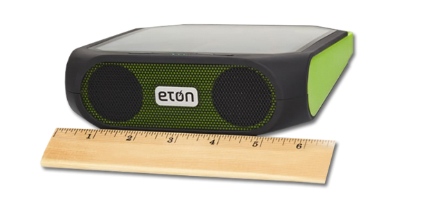
It's fairly rugged, and pretty Ruckus
From a previous KQED membership contribution I already have one of those really fun crank/solar-powered radios/phone chargers/sirens. (That siren is loud; don't hit that switch by accident.) So the alternate power source wasn't the, um, source of my future shock.
That came when the Bluetooth connectivity turned out to be so transparent and good as to be almost magic. I've avoided Bluetooth stuff for logical and emotional reasons; the former being that I knew it didn't work as well as the promised "Bluetooth low energy" , the latter being not wanting to be That Guy talking in public into his douchey ear decoration.
But once you've paired the Ruckus to your computer or phone (in my case), you can use either an AirPlay control on your phone or a button on the Ruckus to toggle streaming of any audio. It's really not any different, carrying the Ruckus around versus carrying your phone, but it's all invisibly streaming and therefore magic.
What's the design principle here we can leverage, going forward (to co-opt how marketing and MBA has corrupted an otherwise pretty good language)? First, leverage familiar affordances: the user controls selection and playback through the iTunes or iPhone (or whichever media player), so nothing new to learn that gets between you and your Savage Lovecast). Second, make informed, reasonable decisions about what should happen when users push non-control buttons: if users turn on the paired Ruckus while playing music on the phone, there it is on the Ruckus; if users turn off the Ruckus, the music stops (instead of playing it on that thing you left somewhere else). The new device becomes a one-button extension or proxy, rather than another damn thing to manage. Again: therefore, magic.
(One potentially complicating option I'd like to see would be a control to turn off or on phone interface sounds when it's streaming to the Ruckus; alert sounds might be a good thing to "always stream", but not the tappy-type of keyboard feedback. Especially since now the sound is coming to you from device other than the one you're typing on.)
The other device is a Garmin Edge 500, which I picked up used from an old schoolmate. This is my first GPS-enabled device aside from my phone. Nope, I haven't even used a rental car with a navigation system.
(Actually, now that I think about it, that's not quite true. Of course our phones today have GPS, and we use that to locate ourselves and map routes. I'm not sure why that never seemed as futuristic; perhaps we think of it as simply a piece of mobile web browsing.)
Perhaps what made the Garmin Edge to FUTURE to me was that I have dealt for over two decades with bike computers that require wheel or crank magnets and pickups, with wiring that snakes over a bike frame. In fact, back in the Avocet days, it was a critical matter of style whether you coiled the cable clockwise or counter-clockwise up your fork and brake cable. A case in point is the installation instructions for a simple, low-end Cateye bike computer:
Lower-tech can mean more tech for the user
In comparison, here's the entirety of the hardware you need to put on the bike for the Garmin to work:
Bike not included
(Plus the BarFly mount, sold separately. More future: the BarFly is made from Delrin, and I think it's 3D printed, IIRC. By a company in Sausalito.)
I'm sure my personal future shock was at least partially due to the man-weeks I've put in over the years of aligning wheel magnets and threading cabling; my training buddies laughed when I was visibly amazed that "it just knows I'm moving and where I am!" reaction. Of course, aside from those moments when it didn't because some pesky tree or cloud got between me and a satellite. (See? My bike was talking to a satellite! Tell me that's not the future we always imagined.)
What's the design principle here that can be our takeaway (again, MBAspeak)? At least: it can take a lot of tech and implementation to reduce the tech and implementation you leave incumbent to the user, which makes for such a better user experience. There's always going to be someone who'd rather pop the hood and adjust a carburetor for that optimal ignition, or the open-sourcer who is happy to recompile the kernel for each application installed, but if you can allow me to just get on the damn bike and ride, I'm more likely to appreciate the experience.
Has anyone seen anything similar?
Vlad from Webflow gave a history of programming languages, through the lens of abstraction layers. What does this have to do with responsive web design, he rhetoricals?
How we as coders and designers "talk" to web browsers is basically via languages, of course. And we've had to hack standards and conventions to do what we want to do, and that involves, usually, getting deep into a language like CSS, or JavaScript, or some library you saw once on github.
So Vlad doesn't want to take Photoshop behaviors to web design. He says they looked at framework tools such as Bootstrap or Foundation and tried to distill these ideas into a visual workflow. (This is also the goal of Adobe Edge Reflow and Macaw.)
Interesting idea, to place a layer/wrapper around what you're working with visually. But what looks promising is being able to export both the HTML and CSS (Edge Reflow has a bit of an issue so far with the former) as well-formed text. And you don't have to remember to place classes. Though you can't live-edit code. Yet.
Automatic handling of server-side forms? I'll have to figure out that later. And curious that they're gunning for Axure RP, to "own the entire experience" by allowing in-app interaction design.
After spending a week trying to learn Zurb Foundation, after reviewing basic CSS, this looks promising.


Update after RWD reflection outside of the RDF:
Though Webflow's goals, their awareness of "still need to do", and mission are admirable, there are still some elements of their product, their fee structure, and their philosophy that could make Webflow problematic for many graphic designers, web architects, and interaction designers.
First is the web-based model. They promise Webflow will be Firefox-compatible soon (for those, like me, who don't want to use Chrome), but it's still a lot of code that has to run in your browser. If you're like me, with a dozen or more tabs that have to be open, you already see your browser chewing up tons of RAM and CPU cycles (here: 2010 MBP w/ hybrid hard drive and 8GB of RAM). Adding the styled UI and app chrome of Webflow into the mix would be a beachball — or worse, a crash — waiting to happen. Not to mention, as an audience member did, that the controls and items in the Webflow UI already are in a small font, and there's currently no way to specify type size apart from zooming in the whole browser content. I'm not sure this works well if you work on a laptop, as I do.
The web-based model also means Webflow hosts the designs you build (some pay tiers offer a custom, hosted domain, such as yourdesign.webflow.com). Of course this makes it easy to point stakeholders and collaborators to what you're working on, and you can download the CSS and HTML (a great feature, and the code looks relatively clean), but it's not clear how well you'll be able to host the code on your own server and point stylesheets and JavaScript links to Webflow's libraries. This is especially acute if you're dealing with server-side forms.
Currently, you also can't use multiple style sheet links in a Webflow project, as you can with, say, Foundation's standard of offloading custom CSS to app.css. Given that they're still working on creating vital CSS components such as menu bars, this ability would allow users to use Webflow even if the company hasn't yet added a component that user finds vital.
But overall, it's a promising start. The "grab a component, place it, style it" model for building CSS and responsive designs is a tool I've long wanted, and asked "why can't we just drag to define a box, and the app delivers the code?" As mentioned above, Adobe Edge Reflow, Macaw, and others, are promising to make easier what's becoming increasingly hard work.
(All credit to Dan Saffer/@odannyboy for coining the term and thinking about microinteractions. For more, see his Brain Sparks article.)

Not the best user experience
This is what I saw after entering my personal information, including a password, and hitting "Continue". So now you tell me.
Actually, in this case the wasted time and effort on the user's part is relatively minor; I've seen similar registration pages that, on fail, "forget" a dozen data fields and force you to re-enter the data manually. And some of these pages don't have the helpful, "Oh, didn't we mention?" guidance as to what they require for a well-formed password.
As Saffer has outlined so well, these are often among the first (and sometimes the last) interactions users have with your site. Add that to my metric of Reduce User Frustration (RUF), and you can see that forgetting such simple tests and tweaks to your site or service or app can have huge effects on the user.
Check out my latest article at UXMag.com: "Designing Down from SF: A Staged Approach". Thinking about designing the future? Love volumetric projections, virtual interactions? Here's a framework for thinking about how to build today what might be possible tomorrow. Or in a lot of tomorrows.
GovJam 13 took place last week all around the world. Volunteer participants had about 48 hours to work on building innovative approaches and solutions towards challenges faced by the public sector. The San Francisco contingent was hosted by Adaptive Path, in their lovely space at the piers on the city's waterfront.
Participants included Code for America fellows, city agency workers, public health researchers, and a healthy range of wonderfully skilled people passionate about the public good.
Our project was GovSherpa. Our mission statement: Matching users facing complex government interactions with citizen guides who have navigated that Terra incognita.
Team members: Patrick Atwater, Cris Cristina, Zoe Madden-Wood, Dan Turner.
There are thousands, if not millions, of people in every city who have lived through complex, stressful, and extended interactions with local or regional government agencies. They may have needed junk hauled from their street but not known whom to call; they may have had to find their way through domestic abuse support systems; they may have found dealing with multiple agencies too confusing and given up on starting a business. Without having known where to go, or what information to have at the ready, their interactions with bureaucracies can often be adversarial and stressful, making them feel that the government is not on their side and causing mass inefficiencies for the government.
There are also as many people each year who face these same problems, but don't know where to start.
GovSherpa
is a simple and powerful matching system that connects people facing
government problems beyond the scope of 311, the SBA, and other existing
agencies, with volunteer "guides". We ask guides to tell their stories,
outline their availability and special expertise; a database matches a
user based on his or her needs to a guide.
Users
can contact GovSherpa directly, or be referred by these existing
services. The guides can connect with the users through their choice of
modes: phone, text, IM, email, or even in person.
In our research, empathy plays almost as large a role as information – people want someone on their side as much as they want to know what to do. And we've seen how people want to share, if the barrier and time commitment is low enough (or even if it is high: emergency responders can build deep relationships in their community: http://www.kqed.org/a/forum/R201306071000).
GovSherpa
allows cities to open up the information currently locked inside
thousands of individual experiences to help lower barriers to government
services and increase the empathy and efficiency of cities, counties,
and states.
You can see our presentation slides here.
We learned a good deal about service design and experience mapping.
We all had a great experience, found the volunteer facilitators and the Adaptive Path staff fantastic, and were excited to propose something that could leverage existing knowledge and help people share what they want to share.
The Discipline of Organizing, edited by Robert J. Glushko. With contributing author me.
Available at Amazon.com – currently a "hot new release! Go get it.
I was fortunate enough to attend the Complexity & Content Data Journalism Symposium at UC Berkeley last weekend. The lineup of speakers was fantastic, ranging from nearly guerrilla projects to evangelists from established monsters such as Google.

That there was a division in the speakers between tech/innovation and policy (the former speaking before lunch, the latter after) was interesting, and not only framed well the challenges in getting started in data-driven journalism (*cough*#ddj*cough*), but the contextual and mission thinking required to do it right.
Even the visual guru Alberto Cairo (who totally pulled off a last-minute change to his presentation in order to fit in a python "language or giant monster?" joke) walked the attendees through what he saw were problematic and successful data visualizations – the key difference being that the successful ones use data and visuals to show a difference, to tell the story.
Catherine Bracy of Code for All (the international effort of Code for America) made it clear that you didn't have to know how to code, but you had to know how to read statistics and data and ask intelligent, rigorous questions. (Funny, I'd just had a conversation at lunch about how the push for "everyone should code" can eat up the oxygen needed to teaching critical thinking.)
It's not a humblebrag to say that getting to introduce Catherine's presentation was seriously nervous-making. She rocks, for the public good. As do the other presenters and attendees. You should have been there.
I can't go into too many details, but you should read the KDMC Storify for details, and check out the KDMC Blog for Q&As with the presenters.
When you're wireframing an existing site and realize you're running out of shades of gray, this may be a tip-off that the structure and design of the site is trying to shoehorn in too many layers of information and actions, overburdening the site's layout and design.
Five shades of grey. Not a sexy best-seller.
Here I've had to use five of the six available shades of grey (I could have created more, but that would dilute the ability of the eye to quickly note the information hierarchy). In fact, I've cheated a bit by appropriating white as a layer in the information hierarchy, too.
This site has a tabbed container which sits on top of a background; this container sports boxes for heterogeneous information. Some boxes have to signal that they are selected (as in the "Hed large text" box, which features a slide show of the content of the three boxes directly below), boxes contain text and links, some boxes have heds of their own, and so on.
A site inventory and full IA map could certainly signal the same red flags, and give systemic insight, but those are often comprehensive and resource-consuming tasks. This took me less than an hour and shows us not only that these red flags exist, but where they are.
Chapter co-author of this UX textbook edited by Robert J. Glushko.
"Organizing is such a common activity that we often do it without thinking much about it. In our daily lives we organize physical things--books on shelves, cutlery in kitchen drawers--and digital things--Web pages, MP3 files, scientific datasets. Millions of people create and browse Web sites, blog, tag, tweet, and upload and download content of all media types without thinking "I'm organizing now" or "I'm retrieving now."
This book offers a framework for the theory and practice of organizing that integrates information organization (IO) and information retrieval (IR), bridging the disciplinary chasms between Library and Information Science and Computer Science, each of which views and teaches IO and IR as separate topics and in substantially different ways. It introduces the unifying concept of an Organizing System--an intentionally arranged collection of resources and the interactions they support--and then explains the key concepts and challenges in the design and deployment of Organizing Systems in many domains, including libraries, museums, business information systems, personal information management, and social computing. Intended for classroom use or as a professional reference, the book covers the activities common to all organizing systems: identifying resources to be organized; organizing resources by describing and classifying them; designing resource-based interactions; and maintaining resources and organization over time. The book is extensively annotated with disciplinary-specific notes to ground it with relevant concepts and references of library science, computing, cognitive science, law, and business."
The Discipline of Organizing, available now!
The other weekend I had the privilege of being a judge at the UC College Hackathon, an event organized by the Data and Democracy Initiative (DDI) at CITRIS, the Berkeley Center for New Media, and the UC Office of the President.
Students from across Berkeley spent a day hacking out ideas and apps to help lower the barriers that high school and transfer students face in applying to the University of California system. It was brief, intense, and creative.
For more info, and to see how you could participate or help, there's the event's wiki page, and a quick video (in which I, to the relief of thousands, do not appear).
Congrats to all the participants and organizers -- it was a good model. Feel free to contact me if you have questions about how you could organize something similar at your school.
I live in List View in iTunes. This is because most of my iTunes interaction is with podcasts, which I listen to while commuting, riding my bike, cooking, etc., for many hours a week. My user story involves refreshing my podcast collection each day, noting (in the Downloads window) what is new), selecting and transferring podcasts to a playlist on my iPhone, and arranging the playlist.
With about 1200 podcasts downloaded, and about 25 lines of listing available per "screen" on my laptop, that's 48 full screens of podcasts to look through (if a "Next Screen" function were available). Scrolling is the default solution, either by trackpad, the thumb scroll, or scroll wheel on my mouse. (Note: searching is not a good option, because you cannot search for "newest" episodes and you might want to discover older episodes.) Scrolling is visually tedious, and produces two problems: "getting lost" and losing visual distinction between podcasts and episodes.
Losing one's place in the list happens because scrolling rapidly enough to make progress through the list results in visual "blur", which leaves the user uncertain what just went past and if parts of the list had been skipped. It's hard to demonstrate in still images, but give it a shot and you'll probably experience this. One major reason for this is that the blue dots on the left dominate the visual field while scrolling. They are the most saturated and boldest (to misuse the word) element in the list, and anchor the user's eye to an almost solid border of blue hard on the left when the user scrolls. Even if the dots don't appear or are half-filled (indicators of episodes half-listened to or not downloaded), it takes many to overcome the solid blue line. And the checkboxes reinforce the problem. The text is simply overwhelmed in motion as the eye tracks vertically, rather than horizontally with the text. The result is often frustration.
(Note: There's no good automated way for me to set up a podcast playlist that I change regularly. iTunes does have a feature for syncing latest episodes of podcasts, but that's not a real solution. Many of the podcasts I listen to have years of archives, some have episodes I'd rather skip, and some are defunct but still worthwhile.
Some of the podcasts are
time-sensitive (Talk of the Nation, Political Junkie, To the Point, Real
Time, and other news) but most are not (This American Life, Wait What?,
99% Invisible, the SpoolCast, On the Media, Commonwealth Club, and many
others). What this means is that before I go out on the bike or to
commute, I go through my podcast library, which I update every day, and
pick and choose what I want to listen to. As implied, this could be a
mix of recent news (The Political Scene), a fun piece of entertainment
(By the Way), or archived knowledge (Boxes and
Arrows, the Nitch, City Arts and Lecture) that I'd like to learn.)
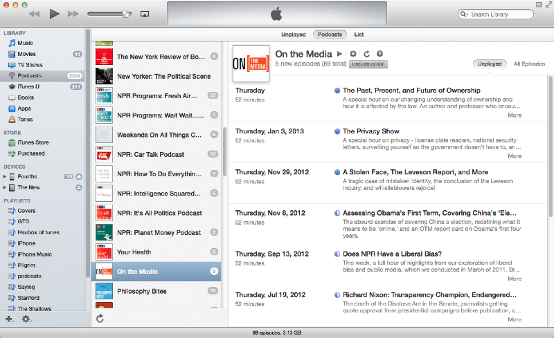
The iTunes podcast view
So I use List View. Which has its own usability issues.

iTunes List view
I suggest three possible tweaks that could mitigate these problems and reduce user frustration: indentation, shading, and bolding.

Indented iTunes List View
Indentation is a common mental model for hierarchical organization, a model reinforced by word processing, outlining, and presentation software. Apple, in fact, makes that kind of software. This presents breaks in the wall of blue dots and could make locating oneself much easier even when scrolling rapidly, and note where one podcast list ends and another begins.

Indented with shading
This indentation could be reinforced with shading; this is a useful visual differentiator in wireframes. Though the opacity here might be a bit dark.

Colorized podcasts
Alternately, the podcast titles could be highlighted, though their relative low numbers could invite visual confusion with them being selected (while the episode areas being shaded looks more like an area).

Bold those podcasts
The titles could also be in bold or a larger type; this would also work with standard hierarchical representations from other types of software.
Testing would be key, of course. A/B testing could be set up between any two of these options, and combinations (bold podcast+indent v. bold podcast, etc.). This would give hard data whether any one or combination results in some improvement in usability — reduced "scrolling past", quick location of podcasts). I can't guess how many users for testing this would require, but even a handful would give important feedback.
And also of course, too, Apple is not known for doing usability testing outside of its own labs. Therefore, to sell this idea to Apple, the best path would likely be to show data that there is a significant issue for user with the current design, and couch the data for our best solution in aesthetic context (I do think the indented version looks better in addition to likely working better).
Thoughts?
They say the "real world is all about whom you know". But does that give the best ideas a real chance to succeed?
http://www.youtube.com/watch?v=Cbf6jpdrVng JLAT in Four Minutes (Video Download)
A proposal for The Foundry at CITRIS The Journalists' Lab for Apps and Technology from Dan Turner (MIMS, UC Berkeley 2011) and Angela Woodall
 SNAPMapper, our mobile "Yelp for food stamp users" app, took third (out of 24) at the Alameda County hackathon last weekend. There was a fantastic amount of creativity and great ideas, all geared towards improving services and access to services for the residents of this huge urban and suburban area.
Currently, people on the state CalFresh and Federal SNAP food assistance programs can find only the location of stores that accept this payment service; the data says nothing about quality, service, availability of fresh food, etc. (that is, the nearest three places may be liquor stores and gas stations). SNAPMapper allows users to locate, rate, and give other feedback about these stores, helping all users learn where they can find healthy, fresh, and inexpensive food for their families. We also hope that this would provide incentive for stores to stock healthier food.
(Our research confirms that a majority of the population in question has access to a smart phone; these phones may, in fact, be their only source of internet access.)
Our data can easily be scraped for the county to match against its own demographic data about CalFresh and SNAP users, to track the efficiency and availability of services.
Since the data we used is nationwide, SNAPMapper could easily be adopted by every county across the United States.
We look forward to working with the county to make SNAPMapper a fully functional web and native app.
There's still a lot to do on just this desktop web app (adding a slider for number of months of interest computed, labels, cleaning up CSS, responsive), but broke through some JavaScript/JQuery issues and it's functional so far. [caption id="attachment_823" align="aligncenter" width="300"] Basic credit card interest calculator -- part of a larger project[/caption]
The live version of this is here.
Once I add the slider (and get it working), then comes: changing it all to JQuery Mobile, customizing the styling and theme (are those substantially different terms?), and starting to learn Phone Gap.
The ultimate goal: This will be part of a public-good project that offers mobile phone users easy tools for visualizing how much each purchase will cost when credit card interest is factored in, for helping users learn how to pay down credit card debt, and about credit card terms and conditions.
Belated notice on this, but go read my new(ish) article about the design challenges facing the iPad as an e-reader. It's up at UXMag.com.
Interaction Designer, User Experience Researcher, Information Architect,
Journalist, very associative thinker. MIMS 2011, UC Berkeley School of
Information -- daniel drew turner
Powered by Squarespace.
