Storifying about iTunes 12 with UX Professionals
This morning, I went to my desk and found iTunes had updated itself, though I'd not upgraded to Yosemite yet. Naturally, I went to do something productive about it, such as complain on Twitter. It sparked a few emotions.

On a Whim: Blue Note
Since I had a few free minutes, I thought I'd take a stab at making an album cover for the long-lost but seminal music stylings of one Jeff Lester (not to be confused with cover act Jeffster). Though Lester's later work is more in the power blues-ballad-metal-folk genre, after uncovering an archival photo of Jeff I thought to go in a Blue Note direction. Granted, this took all of five minutes. Blue Note covers are better. But never shall we match the artistry of Lester's pipes combined with that unique harpsichord-and-fuzz-base sound. In his Blue Note work, one can hear fresh, new iterations on Miles Davis' post-"Bitches Brew" arpeggios, a hint of jazz fusion, and an eerie presaging of Dave Mustaine years before Mustaine recorded.
Design is Tradeoffs, but Adds Value Faster than Costs
A great essay by Joel Spolsky, who knows firsthand that design isn't just making something work, or making it pretty, but balancing real-world constraints to build something that works best for the people who actually use the result of the design.
Actual Job Listing in the World of #UX
Highlights include:
Actual illegal age constraint (hel-looo, EEOC)
Buzzword compliance, while demonstrating lack of understanding of said buzzwords
Contradictions ("It's ok if you have little or no experience in UX/UI" followed by "User Experience")
"Vision"
Actual listing below:
"Introduction:
We have a vision for our early stage startup but we need help completing it. That’s where you come in. Help us discover our identity, define our brand, and ingrain creativity into our culture.
Who we’re interested in:
Someone 20’s or 30’s
It’s ok if you have little or no experience in UX/UI - we’re looking for people with an eye for design
Willing to learn what he/she does not know, willing to adapt to startup life
Skills
Able to execute (draw/wireframe/sketch)
Able to identify good design and user experience and reproduce
Able to communicate their ideas
Someone who will be a core member of the team
Establish design as a core value of the company
Potential co-founder
First hire
The idea is, it won’t be full-time right away. We want to do some trial projects together.
More of a multi-project relationship
Keep the relationship alive
Someone we get to know really well
Big design efforts
Small experiments
Have someone in the room who is very focused on the user and experience
Optional part-time arrangement. Ex: 2 days per week, 15 hours per week, etc.
Full-time after a few successful projects together
NOT interested in a unicorn
Unicorn = someone who can do everything (coding, design, user interface, etc.)
NOT the most expensive, amazing, world-class designer
We are still pretty young and have time to experiment with several ideas, so a branding expert who charges $5k per project might not make sense
Someone who advocates for the user
Current team members are focusing on many different things
Scott - data and code
John - product and fundraising
Designer?? - focus on the user
Personality
Hungry
Motivated
Willing to go in new/diff directions. Perhaps the person is well-versed in Photoshop, but does not know a whole lot about iterating various UX techniques. However, they’re eager to learn.
Understands or is passionate about what we’re doing
Super geeky. Is really, really into X.
X could be:
photoshop, fireworks, etc
User Experience
Wireframes (Balsamiq)
RoR
Etc
User Context
We spent some time defining who we think our user is. We put this information in the Context doc.
Other Website Evaluation
We have done some exercises on ‘what makes good design’. We put this information in the Website Evaluation doc."
Whoa, Fortune, Got Some #UXfail in your CSS
Looks like some CSS/Javascript (probably about the scroll bar's visibility) is disrupting the reading experience.
#UXFail, Google+ Edition
No really, I just don't get it. I saw this in two browsers, latest Mac OS X version and updated browsers.
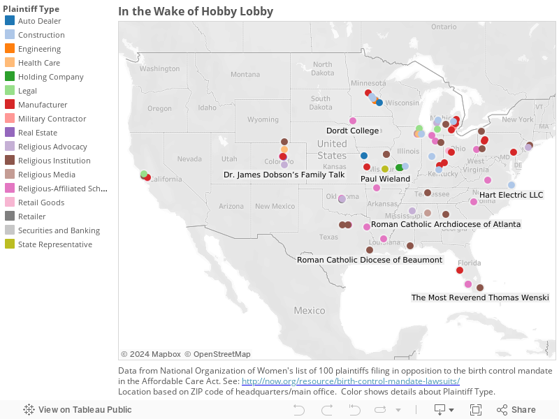
#Dataviz: In the Wake of Hobby Lobby
(Note: One slightly odd feature of Tableau was the lack of scroll bars. Click and hold for a while if you want to drag the map.)
New @Medium Piece: Down and Out in Online Reviewing
Because I'm having fun making header images, thought I'd write something else this week. Hope you enjoy it; you can find it here.
New @Medium Piece: How Startup Founders Can Be Like Iraq Warhawks
You can read it here. And remember, recommendations on Medium are really helpful! Thanks in advance.
#UXFail, Google Drive Edition
First, we see a turn arrow next to the "My Drive" text. Normally, in almost every OS or UI, this signals to the user that this is a control on which they can click, and which click will effect a change in the UI: most usually reveal another level of the information hierarchy. (The canonical example is in List View in the Mac OS Finder. Go ahead, try it now; I’ll wait.)
In this case, I clicked on it, because the principal investigator on our project said she has a file she wanted us to see in a subfolder on Google Drive. I heard "subfolder", so I (not unreasonably, I thought) tried to navigate to what looked like it’d be a subfolder, by clicking on the turn arrow.
As we can see in this video, clicking on the turn arrow does indeed turn the arrow. But that’s all it does. And then clicking on it again does nothing. The turn arrow remains in the "I’ve progressively displayed information" without ever having done so, and remains so smug in its certainty that you can’t unturn it.
Then, on a whim, I click on My Drive. To my surprise, this changes the information shown to the right. It’s fun to note that this breaks the interaction pattern of the Gmail web interface, where the Inbox view is the default view and clicking the top menu item, Inbox, shows that info. So, what was I looking at when the page first loaded? How do I get back to it?
So I click on "Shared with Me". That actually shows some of the files the PI was asking us to look at. Apparently, the mental model in the people she shared with — a separate information category — was not the same as what she saw — a subfolder.
But anyway, how do I get back to the stuff that was on the page when I logged in? My Drive? Nope. That control? No, that’s to upload files, not move up in the hierarchy (whatever that may be).
The Back button in the browser? Give it a try and what the hell? What is this "Activity" screen? (Note: I could not reproduce this, which is itself worrisome for QA.) Let’s try Back again. Okay, we’re back to where we started. Whew. Now about that turn arrow… nope. Still smug. I just must not get it.
MPICT.org Slides are Go
The one-week intensive for community college instructors was fun and educational for both the participants and, well, me. We in this field of UX, to a degree that's so sad as to preclude irony, fail to research and be aware of the needs of so many of the students in the world. They don't have the luxury of choosing to be "a creative"; a class in the basics of Excel may enable them to get a job in data entry and that's a happy step up from their circumstances.
So what's not shown in these slides, which I would add were I to teach this course again, are vocational points, which I tried to incorporate on the fly. These include: you don't need to be "in tech" to work in UX; which process I covered could be careers in themselves (e.g. user research, usability testing) and what skills students would need to develop; various educational interests that translate well to careers (e.g. psych or sociology).
In any case, to make it easier to step through the slides, here are links in order or presentation. For some reason SlideShare doesn't offer a "list by name" option.
Module 01: Intro and Definitions of UX
Module 05: Personas and Scenarios
Module 08: Responsive Web Design
Overall, it was a great experience, I hope for everyone involved. I'll soon post photos and screenshots of what the participants researched and built in just a few days.
Lack of Updates Can be Fatal
Apologies for the radio silence. I'll try to synthesize what I've learned about this week of UX intensive. It's true; having to explain what you think you know really highlights where you need to learn.
Its like one one point I've been reiterating in class (which is to community college instructors, whose students are most concerned about what they see as a job market that's impossible to break into): a large part of our job as UX people is to communicate. Every design artifact, every research finding, has also to be a communication tool. You have to be able to explain what and why at every step.
Quick #UX Hack: The Ultimate Interface
On a recent iMore podcast, Rene Ritchie suggested that his ultimate interface would be "a big red button that says 'Do It'."
Well, red is probably a confusing color, in cognitive terms, to associate with a positive action in most modern cultures. But it was an interesting idea. So I modified it to comply more with what we know about human perception and interaction design and iOS interface standards. That includes buttons that are just text.
#UXMeme: Users and Usability
Jumping to the penultimate module of the upcoming MPICT.org class.
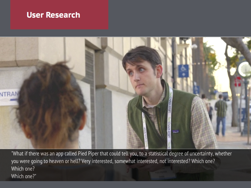
#UXMeme: Do Not Interview Users Like This
Having some fun with slides for upcoming UX intensive for MPICT.org
#UXMeme: Familiarity as a Design Principle
Slides for teaching a one-week UX intensive for MPICT.org.

Teaching at MPICT
Looking forward to meeting my students.
(Teaching a UX/UI Intensive in the last week of June for the Mid-Pacific Information and Communication Technologies (ICT) Center.)